 In this series I will take apart some of the dashboards that I have created and the focus will be on the design choices I made, beyond choosing the right chart type. I think, being able to justify choices like colour, positioning and labeling is a good practise to end up with well designed dashboards which works well for your audience. You can read about the background of this idea here, or have a look at all parts of this series here.
This week was quite exciting as the viz got quite a bit attention, firstly because I asked for feedback for a graph choice and afterwards because it was picked as the Viz of the Day as well as Viz of the Week on Tableau Public! I got a lot of positive feedback and I am pretty stoked about all of this! Of course there were a lot of choices along the way and my own story of having a (personally) justified decision which – as Eva and Andy pointed out – was probably not so justified after all.

Why did I use this particular graph?
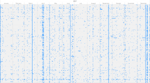
 As many people this week, I struggled a bit with the data as it was really messy. No consistent views on what a holiday is, different terminology and federal and state level holidays without consistent naming. My first idea was some sort of heatmap but it didn’t really seem to work (see on the left).

I did discover however the clusters which make up Christmas/New Years and Easter as well as the 4 solstices and equinoxes in this heatmap and considered that a good enough feature to work with.
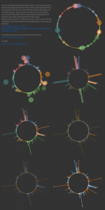
As you might now, these days split the year into four quarters and from this realisation it was just a small step to go from a flat table layout to a circular which would be split into four equal parts by these “holidays”. I created a couple of versions along the way, first to check my formulas and afterwards to figure out how to colour them. Of the four different formats, really just the circles along a single line and the equally sized bars work well, while the floating bubbles are not immediately obvious to understand and the sized bars just look crude.
I ended up using the bars as they made it easier to compare different days (at least the ones close to each other) and it’s easier to distinguish different days; this is a bit harder with the circles as are overlapping. An argument for them would be that it’s easier to see the clusters around Easter and Christmas.
Why did I use these colours?
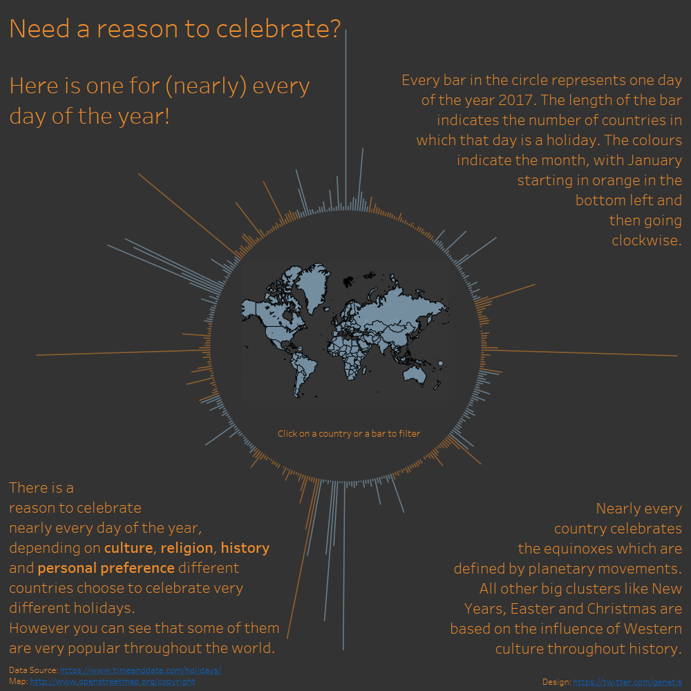
I started off with a dark background because it’s usually easier to see overlapping, transparent bubbles on it (it’s the same reason as in the last two posts). They stand out a bit more and the effect reminds me of fairy lights. Initially I coloured every month differently which looks nice but doesn’t really add much value. Since the sole purpose was to see when one month ends and the next one starts, two colours were sufficient. At the time I can’t remember a conscious decision to use orange but in hindsight I think I was looking for something with enough contrast and not too aggressive. The map inside the circle ended up blue to balance all the orange text around it.
Why is january at the top?
Because it makes a lot of sense to read it like you would read a clock of course!
I originally started the year at the bottom and in the next paragraph I will tell you in detail why I I set it up like this. In the MakeoverMonday viz review, Eva and Andy pointed out that this choice seems odd and it would make more sense to start it from the top. I guess it does make more sense for most people, so I accepted the better argument and changed it accordingly but I still feel like I should explain myself.

It all started when I was in kindergarten!. We used to build a device called a “year clock” (Jahresuhr), which you can see on the side. It has one hand, a section for each season and one section for each month. The hand then indicates what month it is. For some reason we (and I don’t know if it was everybody or just me) build it in a way in which Winter (ie. December to February) was at the bottom, which meant that the year started just off the 7 o’clock mark. Since then, this is how I think about a year. If somebody tells me something will happen next year in March, I envision it to be on the 9 o’clock mark on a circle. It is not a concision decision, it seems just natural to me. Think of it as the path of the sun, everybody knows that it raises in the east and sets in the west. If you grew up in the northern hemisphere you will know it travels through the south and that’s how it is. You do know that it is different in the southern hemisphere but even if you traveled and have seen it yourself, it takes some time to get used to it and until then it feels wrong. This is the feeling I have when I see my graph starting at the 12 o’clock position.
Why does the title talk about celebrations?
As mentioned, the data set was very messy. They had national holidays as well as the “German Beer Day”, which – although you might think otherwise – is not a national holiday and Germans do not get a day off for it! My options therefore were to either clean it up or work around this problem. The first option would not have been much better because how would I know if a holiday in Brazil, India or even France is an actual holiday? Maybe it’s just a day dedicated to something or some other occasion most people don’t even know about? The second option seemed easier to do by just considering every occasion something to “celebrate”. This is still a bit of a stretch for occasions like the equinoxes and, while I write these lines I realise, most definitely for days which commemorate tragic events; however it is still supposed to be a makeover of the viz and not a cleansing competition so I just accepted this trade-off.
Why is the text where it is?
As the majority of the audience will likely read from left to right, I put the headline and sub-headline on the top left as the most important textual feature. Afterwards on the top right you will find instructions, as I assume most people (even if you know how to read this graph) might not intuitively know what it is about. The bottom left talks about the general context of the chart and at the end I highlight the most interesting points, which I considered to be the equinoxes. I find this gives the viz a lot more structure and guides the audiences nicely through the viz, step by step. I also tried to align it to trace the outline of the circle which I think helps to see all of it as one dashboard rather than a graph with text fields around.
Why is the dashboard square?
Because the main shape is a circle! The square creates a nice frame around it, which is reinforced by the text elements.
What else?
One feature which took quite a bit of time and is often overlooked (by developers as well as users) is the tooltip. In this case you will see that the tooltip for the bars and the map will change depending on whether the viz is filtered or not. It’s something you probably won’t notice unless you are pointed towards it, however if this wasn’t the case, it would be hard to find a generic tooltip that works for all countries as well as just one.
Let me know if you think something could or should be changed. And because I got quite a few people asking me how to do a chart like this, you can find a “how to” here: http://www.tableaulearners.com/2016/radial-bar-charts-in-tableau/


Dear Alex,
Nice work.
I have a question.
I am trying to create something similar, I managed to create the radial bar chart with my data, however I don’t know how to link the map to the radial bar chart. How you managed in this case?
Best,
Hi Francisco,
thanks. I used Dashboard Actions to make one filter the other. They essentially take a dimension form one sheet and filter another one by your selection. The exact setup depends a lot on your dimensions and how you want the graphs to behave.
In Tableau you can set them up via Dashboard/Actions or for more details just check google, you will find a bunch of how-to’s that walk you through it step by step.
Let me know if you had a more particular answer and I will try to help as good as I can.
Alex
can you change the setting so we can download this workbook please.
Hi Eric,
Just changed the settings and you should be able to download it now.
Alex
Hello,
I usually download workbooks with new ideas from the tableau.com website, but even when logging in, I can’t download this workbook. “Permissions are required to download the workbook”.
Is there any chance you could share it with me or send it by email?
Cheers, and congrats on an awesome Viz (design and execution-wise)
Hi,
Sorry I meant to make it available for download already.
Changed the setting now and you should be allowed to download it now.
Glad that you like it.
Alex