

This weeks #MakeoverMonday was all about dietary requirements. A really simple data set about the percentage of people in the different regions of the world who follow certain special diets (kosher, low sugar, dairy free, etc.). While working on it I started thinking about the message I communicate and how that relates to any other dashboard that I create.
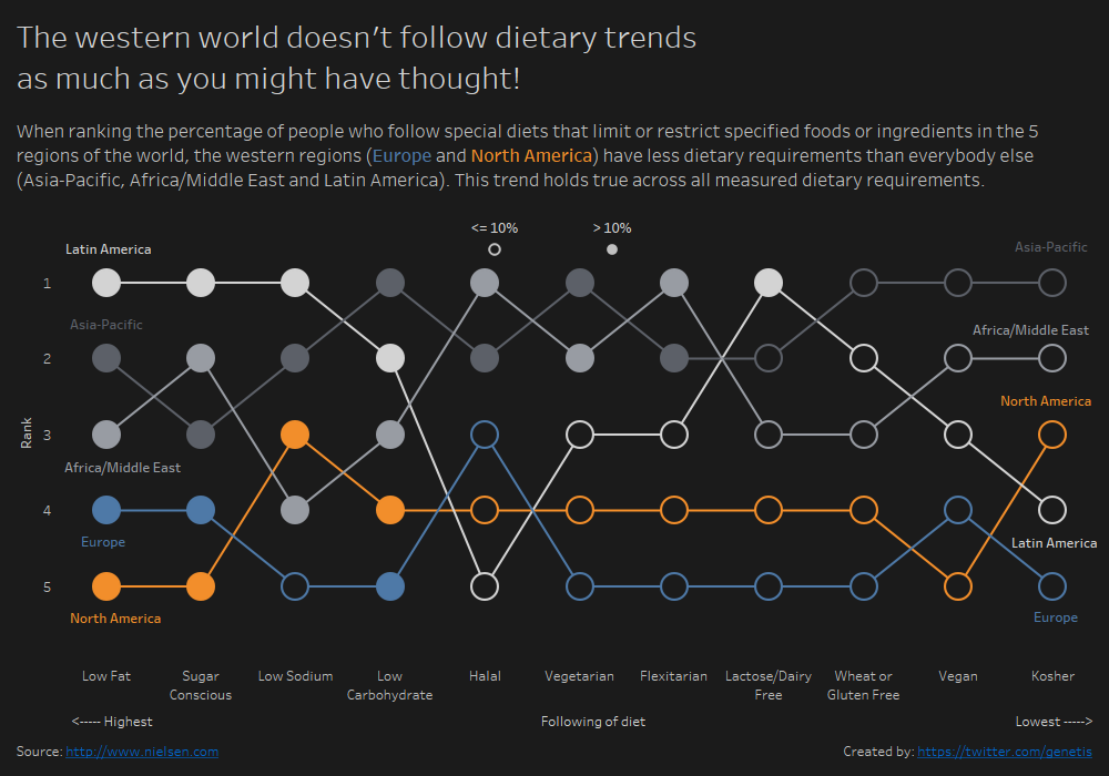
Dietary requirements is a very uncontroversial topic you would think (if you ignore the turf wars between vegetarians and meat-eaters and alike). I did what I always did for #MakeoverMonday and just created random graphs to see if anything catches my eye and I quickly spotted a trend that I didn’t expect. Living in Europe most of my life and having lived in Latin America and China for a while my impression was that diets like Gluten free, vegetarian/vegan or low carbohydrates are a phenomenons that largely appear in Europe and North America rather than Latin America or Asia. Try to live gluten free in China or vegetarian in South America and you will see what I mean. It is certainly possible but a lot more difficult in Santiago, Buenos Aires and Shanghai than in Berlin, London and New York.
Having found my story and a visualisation that I found appropriate, I had to put some words to it, to not just have a graph on it’s own; and at that point I had to think about how I put it.
I needed a term that separates Europe and North America from APAC, Latin America and Africa.
- First World/Third World: I have learnt that in school but it felt wrong; especially knowing that people from those regions would see it and probably cringe being called part of the Third World.
- Developing/Developed Regions: I considered that more appropriate and actually went for it initially. It doesn’t have the negative connotation of Third World and being a developing region doesn’t necessarily mean your country cannot be a developed country.
- Western World/Everybody else: This doesn’t have any negative connotation to it as every other region would be based on geography or religion.
Going with my first idea Developing/Developed world, I thought about headlines:
- “The developed world doesn’t follow dietary trends as much as you might have thought!”
- “The developing world follows dietary trends more than you might have thought!”
- “Developed world has lower demands for their diets than the developing regions”
- “Developing world has high demands for their diets”
And more blunt ones like:
- “Developing regions are more picky than Developed regions”
- “Developed world doesn’t care about special diets as much as developing countries”
They all convey the basic story, in one part of the world, more people care about their food than in the other, however the message of most of them goes more or less like “You won’t believe they are actually in a position to care about gluten or low carb!”
While I consider this a very low impact change as usually less than 50 people even see my #MakeoverMonday dashboards, I eventually switched from Developing/Developed to Western/Everybody else. (click the image for the interactive version)

But there is a bigger theme here!
What parts of a data set do you visualise? How do you display it? How do you communicate your findings?
These are choices everybody makes, consciously or unconsciously, with every graph they create and every dashboard they publish.
What to visualise?
- Do I use Sales or Profit? Or EBIT? Or EBITDA? Or ROI, RONA, NOPAT or WACC?…you get the point
- Do I use weekly/monthly, as it is or as a rolling average?
- Do I compare to last year or budget?
- Do I display absolute or percentage? Or Absolute difference or percentage difference?
As a consultant, clients usually come with a very firm idea of what they want (“Weekly sales in a rolling sum over 6 months as a bar graph broken down by product!”). More often than not after looking at the data you see that this particular calculation looks that little bit better than if you just displayed the weekly sales.
As an analyst in a company you might not feel in a position to question the way something is calculated and just go with the flow or you actually have the choice between different measures and choose the one that looks better because you know it makes your boss happy.
How do you display data?
There are well documented best practices in the first chapter of every book on data visualisation: bar charts for categorical data, lines graphs for timelines, histograms for distributions, don’t use pie charts, … but it doesn’t stop there.
- Do you highlight data points?
- Which points do you highlight? The maximums? The minimums?
- Do you display this negative trend prominently or hide it between more positive trends?
One very good example that I wouldn’t have thought off and which plays back to my initial problem of how my graph is perceived by the people that it talks about is this example of
[…] a map of concentrated poverty in Minnesota […] where individual participants were marked by red dots. When presented to the actual participants living in these areas, they were not stoked. Instead, they felt like they were perceived as a threat, and the little pixels made them look almost like an infestation on an otherwise subtly colored map.http://stephanieevergreen.com/dataviz-inequality_pt1/ (It is worth reading part 2 and 3 of this series as well!)
This is an example of an analyst unintentionally insulting people and while that might not necessarily happen at your workplace, with random data sets like the ones in #MakeoverMonday you might suddenly be in a similar situation.
How do you communicate your findings?
- Do you phrase it as a question or a fact?
- Do you focus on the positive or the negative?
- Do you give context?
- Do you assume they know the data and terminology or do you explain it?
- Do you tell your audience what to take away or do you let them draw their own conclusions?
It might be tempting to provide the tools for your users to investigate and learn an insight themselves but can you be sure they take away what you want? They might find a setup which leaves them to learn the complete opposite of what you intended to communicate.
Think before you publish
It’s easy to forget the implications of a visualisation or a business report because, after all, it’s just data. But in the best case every dashboard or report you create leads to an action by the user (because if it doesn’t, what’s the point of the dashboard?), and at that point there will be real life implications somewhere. Who gets a bonus based on sales performance? Which branch do we have to close because we don’t have enough customers? When do we do our Christmas party and who cannot attend if we do it on that day?
Some implications are less important than others but they are a direct result of the work that went into creating the report, therefore you should be aware of the responsibility that comes with it.
Excellent post Axel!!