


I recently gave a guest lecture at the University of Auckland for the Data Visualisation Students. Andrew Eberhard, the lecturer, asked me to talk about myself and my background, my job and the industry, data visualisation in general and Tableau in particular. It was a bit strange to actually describe my job and how the different aspects relate to each other but at some point I found a great way to describe it…visually! If you have an hour time, you can watch the video below, otherwise I will outline what I talk about in this blog post.
The Job Triangle
I don’t think many people regularly consider their position in life, what they are doing and how this relates to a bigger picture. I am extrapolating a lot here since my sample includes only one person who I can be sure doesn’t do it very often…myself. To be a bit more specific, I don’t think people think about their position in the bigger picture. In a way that it can be communicated in a coherent way to a room full of other people.
When I started doing exactly this, I was thinking about the relationship between myself, my company and the clients who we help making sense of data. It occurred to me that this is a very general concept for consultants as well “resident analysts” and even students. All of these roles have tasks and deadlines and people who expect to see outputs at certain deadlines. As a general concept I think everybody can relate to this setup.
After considering this for a while I had the idea for this concise yet impactful visual which would help me illustrate my thoughts:

There is not much more to gain out of the triangle metaphor at this point but it serves as a simple reminder that all of the three entities are closely connected.
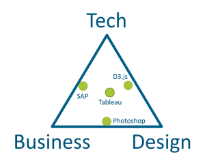
The Expertise Triangle
Apart from the workplace, another very important aspect of my job can be put in a triangle as well: the typical skills required by somebody who works in “Analytics”. (This is such a broad term but for the purpose of this post includes jobs which are closely related to the task of organising, making sense of and communicating data)
The typical skill set for somebody doing analytics includes
- Technical knowledge! How are data bases designed? How do I combine data sets? How do I develop data pipelines?
- Business knowledge! How is a company steered? Which information is important, which isn’t? How do I translate an insight to the actual impact for the business?
- Design knowledge! How do I present data in an easy to understand way? How do I design user friendly interfaces? How do I make something look good?
All three are important, it is however difficult to impossible to be very good in all three aspects at the same time! At this stage the triangle starts to make sense. You can only be in one corner at a time and while you are there, you cannot be further away from the other two corners. If you move closer to the middle, you come closer to the other corners but increase the distance to the first corner. In real-world terms this means there are specialists out there who are really good and comfortable in their corner and generalists, who can cover various different aspects superficially but struggle to go in depth in any of them. Both types are important and needed, the problem is just that you often cannot replace one with the other.

From my experience, companies are usually missing generalists which can work across the different fields of analytics. It is reasonably simple to find a business person who can handle business decision, but finding one who also can handle technical tasks is a lot harder. Similarly there are lots of data scientists out there looking for jobs, but finding one who can visualise their output and explain it in simple terms to business users is a different story.
The same principle applies for the tools which we use. They tend to be along the edges of the triangle, like SAP (between Business and Technology) or D3.js (between Technology and Design) but they are usually more specialised tools (with the notable exception of Excel, which does everything at once for more than 30 years already). Trying to get a business user to work with D3 or a designer to get something out of SAP is usually hard work.
This landscape changed in the last years towards some more general tools. Tableau being a strong force within this change but similarly PowerBI or smaller tools like datawrapper allow people to create data visualisation outputs which more or less cover all three areas.
Personal Development
I personally never considered myself very creative or even a designer; I have always been more on the tech side of things. I like the structure of programming languages and equations and find it hard to come up with ideas for more “artsy” things like images or music.
During my apprenticeship and my studies I learned a lot about business topics, controlling & accounting, project management, company structures, etc. This allowed me to move away from the tech corner further to the middle between the two.
After moving to New Zealand I got involved with data visualisation and the community surrounding Tableau. I realised that design is a set of rules which – once applied – help people to navigate through their dashboards more easily. As long as you can justify your choices, the design will generally be better than if you cannot justify them. It doesn’t help you to come up with innovative layouts and arrangements but it helps creating dashboards which look good and are understandable. With learning more about the visual aspects of charts, I moved a bit more towards the design side of the triangle.
By now I would consider myself somewhere in the middle of the triangle, probably a bit more towards the top than the other two corners but with a good understanding of all three aspects.
Design is…!?
The problem with my realisation that design choices need justifications is that it is a theoretical one. In business design is not justification, design is compromise!

People insist on stacked bar charts with 20 categories but only 10 colours, they provide data which is hardly analysable and they generally consider design to be the pretty front which isn’t as important as whether or not something works. What they often fail to understand is, that good design usually means that something is functional and easy to use. It is not a pretty layer on top of the function, it is the set of rules that determines functionality and how to access it.
At this point it is up to the analyst to decide which battles to fight and in which cases to just surrender to the business requirements which call for the horrendous corporate colour palette. To succeed in this environment, there are some skills essential which in my opinion everybody should work on and companies should look for.
The Skill Triangle
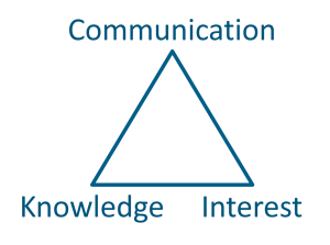
- People need to be able to communicate! They need to be able to literally express their thoughts and thought processes in a way that everybody understands them and they need to be confident enough to speak to a large or a very senior audience.
- People need to have knowledge! It is not enough to just know how to use Tableau or how to script in R. They need to bring different skills, not on an expert level but in a way that enables them to approach problems from different angles.
- People need to be interested! With a look in the community, there are tons of people who spend hours and hours on visualisations, blog articles and community events. These people get better and these people stay on top of things. It is very hard to be good if you just do the basics
In this triangle, the three corners are not mutually exclusive. The perfect candidate would be interested in their work, which leads them to learn more and gain more knowledge. Often (not always) advanced knowledge of a topic enables people to talk about it, in front of others and if they really understand it, they will be able to explain it in simple terms.
There are so many opportunities out there to work on all three areas that there is hardly any excuse to not get better. User Groups and Fringe Festivals to practise talking, initiatives and challenges to practise skills and forums and platforms to network with others.
The hardest part is putting yourself out there, daring to expose yourself to opinions and criticism and to engage with others in discussions. Fiona Gordon recently listed a whole bunch of reasons and resources to get involved with the community!
Q&A
In the Q&A at the end of the talk somebody asked me if I found it hard to get to where I am at the moment. My answer was “no”. I think I need to elaborate a little:
Yes, it was a lot of effort! On top of my normal job, I spent easily 10+ hours in some weeks to work on MakeoverMonday submissions or reading books and blogs. I practise techniques and follow what’s going on to stay up to date, write blogposts and discuss aspects with others. It is part of my life and I do it in the evenings, in the train and on the toilet.
No, I didn’t find it hard! It is fun! If I think it’s getting too much, I have a break! It’s a hobby which makes me better in my job and vice-versa. Just instead of following rugby matches or the local theater scene, I watch out for new graphs and the next #IronViz!