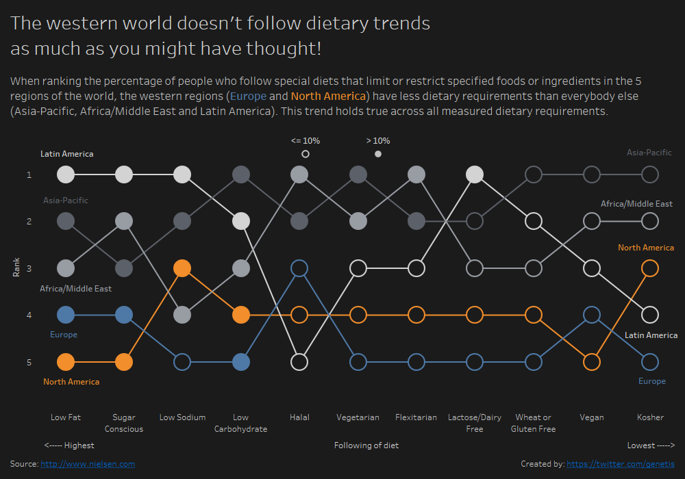
 In this series I will take apart some of the dashboards that I have created and the focus will be on the design choices I made, beyond choosing the right chart type. I think, being able to justify choices like colour, positioning and labeling is a good practise to end up with well designed dashboards which works well for your audience. You can read about the background of this idea here, or have a look at all parts of this series here.
For this weeks Makeover Monday I struggled a bit to find a way to display the data. Percentages of unknown populations are quite an abstract concept, so instead of trying to compare those, I made it even more abstract and chose to compare how they rank between each other.

Why did I use the colours that I used?
Because the story is about Europe and North America, those two have eye catching colours, while the others are more muted in the background for context. Europe is blue because of the European flag. I first chose red for North America (US and Canada both prominently feature red in their flags) but I found it too politically charged so I chose a more neutral orange which goes well with the blue.
The other regions are grey because a third colour was unnecessary and using shades of orange or blue would have associated them with Europe or North America. I chose the lightest and darkest grey of Tableau’s native grey palette and then a middle one to make sure they can be distinguished.
With these requirements a black background works much better than a lighter one as the two colours and light greys would be too bright to look at them easily. It is not a full black but a little bit brighter just to make it a bit nicer to look at. For the same reason the font colour is not white but a bright grey to keep the contrast a bit lower.

Why did I use full and empty circles?
I had the choice between more colours (which would make it busier to look at), different shapes (which makes it hard for the user to grasp easily or filled and empty shapes (which don’t have those problems). I chose the third option for obvious reasons and decided for circles because that’s a more natural shape to mark something than a square or triangle.
Why did I include the axis label and values?
In an earlier version I included the Rank in the label on both ends of the lines but showing it to my partner for a test made clear that this doesn’t really work, especially when you are not familiar with these kind of charts. As I needed to include them, the next best option was to display the axis and describe what the numbers mean. In hindsight this also looks a lot cleaner.
Why did I put the labels where they are?
I try to avoid legends where possible, so I needed to label the lines anyway. They are as close to the lines as possible with the same colour to make clear which line they refer to. I moved them around manually so that between two circles is always only one label and that labels interfere as little as possible with the lines, that’s why the alignment changes from above to below the circle when there were a rank swap just next to the label. The labels are on both sides that people don’t have to switch back and forth to identify which region they are looking at.
Why did I sort it how it is sorted?
At least in the Western world we read from left to right, so I ordered it that the diet with the highest percentage of followers (ie. arguable the most important one) is the first.
Why is the axis label for the sort below and not above the chart?
I tried it above the chart initially but it wasn’t clear what it referred to, so it moved below the chart, close to the axis labels it belongs to.
Why does the heading include the line break at that position?
Because Andy Kriebel didn’t like it where it was before! It broke before the last word, which looked weird. Now it breaks and creates some sort of punchline. The Western world doesn’t care about dietary trends! … As much as you might have thought!
Why the dashboard size?
It is big enough to fill most of the screens sufficiently without causing too much scrolling on smaller screens.
Why is the legend where it sits?
It’s after the text because if it was before, people would skip the text and check what it refers to and before the graph because people have to know what the circles mean before they look at the graph.


