

 In this series I will take apart some of the dashboards that I have created and the focus will be on the design choices I made, beyond choosing the right chart type. I think, being able to justify choices like colour, positioning and labeling is a good practise to end up with well designed dashboards which works well for your audience. You can read about the background of this idea here, or have a look at all parts of this series here.
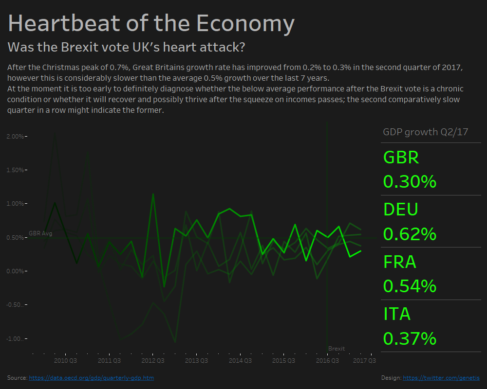
For this Makeover Monday set I initially played around with the data and was suddenly reminded of a heart rate monitor. This very quickly set the theme and influenced most of my design choices.
Why did I use the colours that I used?
The background colour was determined by the theme and needed to be dark. Like usual with dark backgrounds I used a grey that is only slightly lighter than black to reduce the contrast (see example below). For the green I needed a neon green that you would find on a heartbeat monitor, at the same time I needed to find a way to fade it out on the left. I chose to start from a pure green (RGB 0,255,0) as the brightest one and because I needed 8 greens (for 8 years), I chose to user increments of 30 to get a fairly even distribution (0,30,0 – 0,60,0 – 0,90,0 – etc).
The text colour is again a bit off white to reduce the contrast and axis labels are a bit darker to be legible but not to prominent. Looking at it again I should have changed the colour for the tick marks as well.

Why did i use transparent lines for other countries?
The focus was obviously on the UK; I played around with a few ways to highlight one line and settled for this approach. Darker greens would either not have been different enough or not recognisable anymore. Additionally transparency supports the fading-out effect of a heart rate monitor.
Why did I include the axis label and values?
The numbers are not intuitive and rather than only the relative change, the concrete figure gives important context, so an axis was necessary.
Why did I include green reference lines?
The Brexit vote needed to be included because it is an important part of the topic. The average GDP growth gives important context as to how good or bad a mark is. They are dark green because they are part of the “monitor screen” but should not be as prominent as the lines.
Why did you include the BANs?
On one hand, again, they support the heart rate monitor theme, on the other hand by default they give important context and instantly highlight the GDP growth of the UK in comparison to other European countries. When you hover over the graph, these BANs display the actual values for that point in time.
Why are there lines between the BANs?
As a general rule of thumb you should remove clutter from your dashboard. Borders and lines usually count as clutter if they don’t help understanding your dashboard. In this case they divide the BANs properly and make clear that 0.62% is the GDP growth of Germany and not France.
What about headline and text?
The headline introduces the theme and the domain (economy), the headline below defines it further (while keeping the theme) and asks a question about the data that we intend to answer. The text explains what the user is looking at, what it means and supplies an attempt of an answer. In this case the answer is “maybe, we need to wait longer and see what happens.”