

When you work in Data Visualisation, there is no way around bar and line charts! They are arguably the most fundamental and versatile graphs out there. They are so versatile that Tableau’s Andy Cotgreave formulated a law around them:
The longer an innovative visualization exists, the probability someone says it should have been a line/bar chart approaches 1
Andy Cotgreave – Infoworld, 2016
Everybody with access to Excel knows how to build them and even kids in school learn how they work and how they should be read. With this ubiquitous presence, one would think there is not much more to talk about. After all, it doesn’t get more simple then bars or lines.
The other day I was working on a graph, showing sales over time; most of you would agree that the default chart for this kind of data should probably be a line chart. It’s a continuous time series and those are best visualised with a continuous line. Well, for a few different reasons I was contemplating using bars instead but wasn’t 100% convinced that this would be a good idea; so I asked my dataviz network for help.
I got a lot of different answers, all of them telling me that – in general – it is acceptable to use bars for time series although there are a few aspects to consider in order to do it right. They confirmed a few of the thoughts I had before and raised some points I didn’t think of at all. However before settling for bars, I consulted my dataviz library and was disappointed! I couldn’t find anything that came close to an answer.
- The WSJ Guide to Information Graphics: Does not talk about the specifics but implies that bars for months and years are acceptable (p.59/65)
- Storytelling With Data: Acknowledges that lines are “most commonly used to plot continuous data” and uses lines throughout the book for time series with few positive examples using bars for years (p. 156/158)
- #MakeoverMonday: Explains chart types in chapter 10 but skips over line and (simple) bar charts
Lastly, there are some well known online resources, so let’s check:
- The Financial Times Visual Vocabulary: Considers line charts the default for time series and says that columns “Columns work well for showing change over time”
- Dr. Abela’s Choice of Chart: Finally we are getting a little bit closer to an answer. Lines can be used when we have many periods and/or many categories, while bars should be used with few periods and few categories
There are much more books and online resources and I would hope some of them would cover this topic but at this point, I would have probably given up if I wasn’t determined to find some rules. So if you cannot find rules readily available, let’s try to derive them ourselves. Many of the rules which we consider “visual best practise” are rooted in the basic visual perception and the usage of metaphors to encode figures in visual objects, so let’s apply this knowledge to the problem at hand.
And before we start I quickly want to acknowledge the input of everybody on Twitter and the DVS Slack who pointed me in the right direction, more on this at the end of this post
The big difference
I think everybody who worked a little while in visualisation will agree that, if you have the choice between bars and lines, you use bars for discrete variables and lines for continuous ones. Sales per category should probably be a bar chart while sales over time should probably be a line chart. Now there are exceptions to every rule, however as a rule of thumb I would recommend this approach to everybody who is unsure about which chart to pick!
Lines instead of bars?
I think we can also agree that for discrete variables there is usually not the possibility to replace bars with lines. Lines imply a connection between the different values and this is not the case for discrete values such as different categories.
Lines for discrete values? Bad idea!
Rather use bars instead
Bars instead of lines?
The other way around though there is not such a big problem. I am pretty sure all of us have seen time series charts with bars instead of lines. I don’t think any of us would strongly object to this, in principal. But if we agree that it CAN be done, certainly there must be rules when it SHOULD/SHOULDN’T be done. Usually there is no situation where we can just pick one of two choices and it doesn’t have any influence in the outcome.
So let’s see what we need to consider when picking bars or lines:
How many periods?
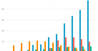
As Dr. Abela already indicated, the number of periods displayed plays an important role. This is a very soft rule which depends more on the context/delivery of the chart than the actual data. The answer here might change depending on the dimensions of the chart. If you have only a few marks, using bars can be appropriate (considering all other factors below). If you have a lot of marks, you should use lines as bars will make the chart too busy. How many “a few” and “a lot” are depends a lot on the space you have available.
Bars are fine if you have only few periods
so are lines!
If you have many periods, bars appear to be more chaotic
When using lines instead, it is easier to understand what is happening
How much “ink” can you use?
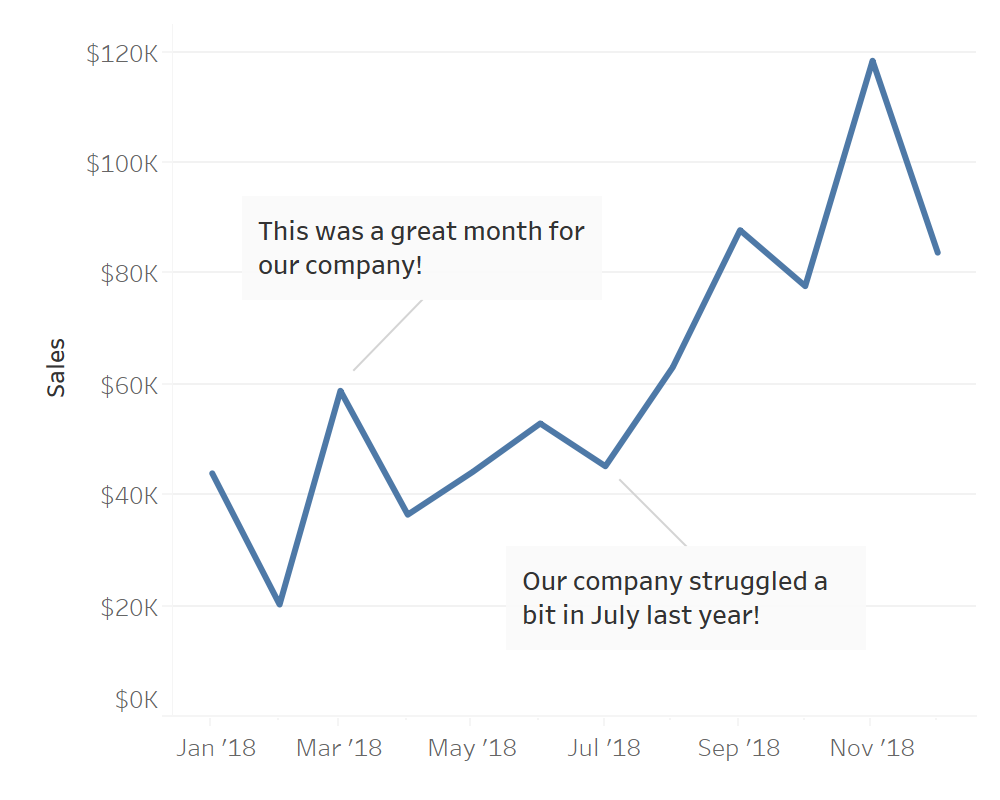
Another mostly aesthetic consideration is how much of your space do you want to occupy with your data? Often, a line chart looks a bit cleaner because it doesn’t cover a lot of the chart area with “ink”. Another advantage of a line chart is that you can add annotations easier underneath the line, while it makes it more busy on a bar chart and requires some workarounds to make sure it’s easily legible.
Bars use a lot of “ink”, they appear more busy and you might need to cover parts of the bars to add an annotation

Lines usually come with more white space, which can be more easily used for annotations
How many categories do you use?
Referring to Dr. Abela again, you can use bars if you have one or “few” categories. I would actually define it more strictly; for just one category, a bar is fine, for more than one it should be lines. The reason for this being that for more than one category you will need to use grouped bars which makes it difficult to perceive the development for either of the categories. At this point it works better to have to continuous lines which make it easy to see how they relate to each other.
When displaying different categories, grouping by year
It becomes a lot easier with lines and you can often get away with fewer colours.
or by category, makes it hard to compare the trends to each other.
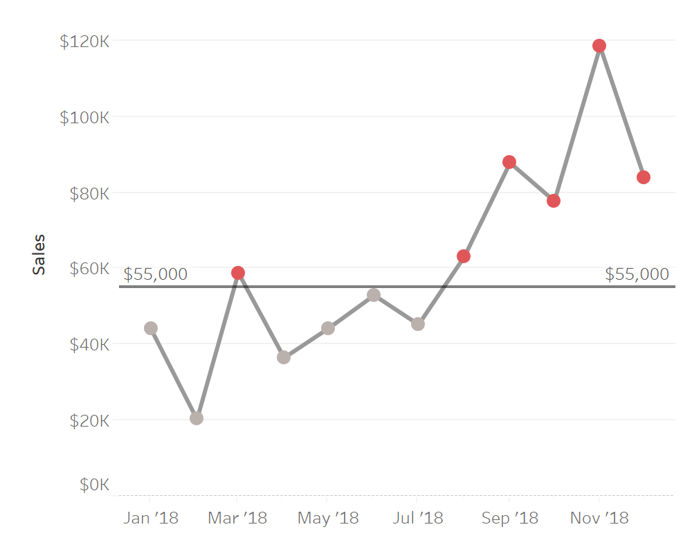
Do you have a target?
Do you have an important reference value which segments your data? You might have a monthly target and want to visualise whether or not it was reached. Or indicate whether or not a value is above the average. With bars you can easily colour the bar based on this condition. For a line chart a colour change would be less obvious (if at all).
Bars allow to highlight another attribute very easily

With lines it’s only really useful when adding additional markers
Importance of NULL values
How important is it too see values which are missing? Does your audience need to see those clearly to understand the main message of the graph or are those values not so important?
If you visualise monthly sales with values around 100.000$, you probably want to see if in one month there are no sales at all. This could indicate either a problem with the data (a filter set up wrongly or a problem in the loading of the data) or it could show that your company actually didn’t sell anything in this month. In both cases I am sure you would want to know about it in order to fix the root cause. The problem with a line chart however is that it might just ignore the missing values and connect the mark before and after – bridging the gap and hiding it. With bars on the other hand, you would see an actual gap between the bar before and after so that it is clear something is missing.
With bars I can instantly see whether a value is missing

In a basic line chart there is no way for me to pick up that the data for August is missing
What do you measure?
Let’s think for a second about how bars work. We compare the length of two bars with each other, in this regard it’s similar to having two glasses next to each other and comparing how much they are filled. In the physical world, we compare amounts of something. In the digital world we can use the metaphor of bars to do the same. On the other hand, if we have more abstract measures this metaphor might fail. An unemployment rate does not have an absolute amount which could be filled in a container. Atmospheric pressure is an abstract measure which cannot be represented as an amount. These figures are better represented by lines.
How often do you measure?
This slightly overlaps with the previous point. Let’s assume you measure wind speed once an hour, at 8 you have a wind speed of 15 km/h and at 9 you have a wind speed of 20 km/h. Now, although this probably doesn’t mean that it was 16 km/h at 8.12 and 17.5 km/h at 8.30, we would have been able to measure every wind speed between 15 and 20 km/h at some point in this hour. It makes sense to connect the two marks with a line because we could draw a line to the y axis at any point and we would get a wind speed which we could have measures in this time frame. On the other hand a bar chart with a bar per hour could be misleading as it might look like the wind speed was at 15 km/h from 8 to 9 and at 20 km/h from 9 to 10, although it was just a single point measurement.
Now let’s assume we visualise daily sales. On Monday we have sales of 10,000$, on Tuesday we have sales of 5,000$. If we connected those two marks with a line and followed the same logic as above, this would mean that at some point between Monday and Tuesday we would have had sales of 7,500$. This cannot be the case, so a line would be misleading. Here it would be more appropriate to use bars, since they are aggregates over a distinct time period.
If you paid attention, you will have realised that this contradicts the initial rule of thumb, as per which the default choice for a time series should be a line chart! The answer to this is that most line charts have quite a lot of values (monthly sales for the last 3 years, daily stock prices for the last 3 months, etc.). We consider the complexity of the graph more important than the underlying metaphor, so often we use a line because it’s easier to read rather than bars which would be a better metaphor.
Bars often imply that a value represents an aggregate over the whole observed time frame
While lines work better for single point measurements within a larger period
Do you show small changes of large numbers?
If there is one unbreakable rule in data visualisation, it’s that you cannot truncate bar charts! Ever! This can actually create problems when you want to visualise small changes in large values. A way around it is to use a line chart and truncate the y axis. There are still a few rules to follow to make sure your audience understands what is happening but then it is a lot easier and less misleading than truncating the axis of a bar chart.
bars can NEVER be truncated so it’s difficult to see the change here
With lines I can truncate the y-Axis (carefully) which makes it much easier to see the change
Where from here?
To be honest if the only problem in your visualisation is that a bar chart could marginally improve your line chart, I think you did very well. In my particular example I don’t think it would have mattered and I am 100% sure that nobody would have questioned either of my choices. For me it was a learning exercise, where I found a question which I felt I should be able to answer but couldn’t.
I tried to come up with a flow chart or a decision tree to figure out the ideal chart for each situation but it is just too complex. As so often in data visualisation, there are no clear cut rules as to when you should use a bar chart and when you should use a line chart. It just depends on the context.
As a rule of thumb I would always default to a line chart for time series data. However being aware of these nuances of data and visualisation I think helps with other aspects. After all it DOES matter what kind of data you want to visualise, how and when it was measured and in what context it is visualised; even including a slightly longer time frame might actually justify a change of chart type.
Data is not just data and while these differentiations might seem academic, they need to be considered – one way or the other – in every project!
Acknowledgements
Lastly, huge thanks to the Community who came up with way more criteria to consider than I could have ever on my own! Special shout out to Nicholas Kruchten on the DVS Slack channel for a lot of contributions and Neil Richards who commented on Twitter and contributed a second pair of eyes to make sure I didn’t write anything stupid in this post!
Further Reading
There is much more to be said about line charts! If you are interested, you can start here:
- What to consider when creating line charts – Lisa Charlotte Rost
- Let’s Chart: stop those lying line charts – Noah Lorang
- Line Charts: Where to Start? – Tim Brock
- Doing the Line Charts Right – Gregor Aisch.
- Aspect Ratio and Banking to 45 Degrees – Robert Kosara
interesting, thanks for the overview. i am surprised though that you are missing one factor that i intuitively find most important here: i would always stick to line charts for time series data, except if the variable is a growth rate i.e. percentage change in which case i often feel that bar charts are more appropriate. i’m not sure what this intuition is based on though, how does it seem to you?
That’s a good point and I’d say your intuition is probably right. I haven’t explicitly called out this example, but it roughly aligns with the “How often do you measure?” section.
You can consider a growth rate for a time period a discrete value. There is no “in between” the growth rate for one month and the next, so bars (probably) make most sense.
Pingback: WHEN CAN A LINE BE A BAR? - Tableau Training