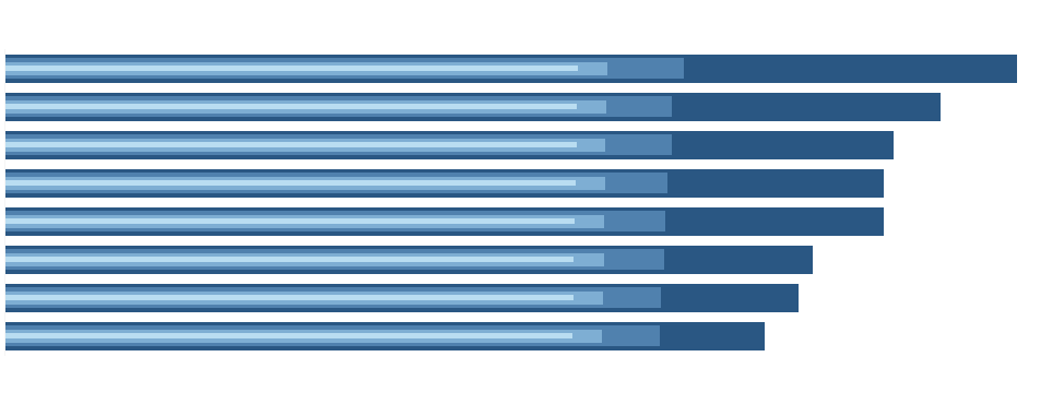
A few days around a collection of “Weird but (sometimes) useful charts” was passed through the Twitter community. While many of them have very defined use cases in science, and some of them are plainly ridiculous (I am looking at you Drunken Speedometer) a few might come in handy in some cases. One of them is the piled bar chart, which I built in Tableau. Scroll to the bottom or click here to go straight to the workbook on Tableau Public
What is a piled bar chart?
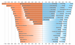
In it’s simplest form you create a piled bar chart by creating an ordered bar chart, cutting the list halfway through and overlaying one part on top of the other. The resulting graph has the largest bar in one row with the [(n/2)+1]th bar and so on. In a more complicated form you could split the list of bars in 3rds, 4ths, etc. and overlay all those parts.
When you look at it, it does look a lot like a stacked bar chart, which can cause some problems which I will address further down.
How do I conceptually create one?
Since we cannot literally split a list of bars in two and move it around, we need to find a more technical solution to achieve this. If we want to have two marks in the same row in Tableau, they will need to have a shared value in one dimension. As we want the whole setup to work dynamically, we cannot use existing values, so we need to calculate this value. The easiest way to achieve this is by incrementally numbering the bars depending on their order, starting at 1 again once we reach the middle of the list. Once we have these numbers, the first bar will be “1” and the first bar after we reached the half of the list will be “1” as well and so on.
How do I actually create one?
For this exercise we will look at our sales per customer from the Global Superstore data set. If we create a simple bar chart to compare sales per customer, we end up with a list containing more than 700 bars which requires a lot of scrolling. This is rather awkward and not really user friendly.
To start on our piled bars, we need to do a bit of prep work because of the way Tableau calculates values.
1.
We will need to have the values of our bars accessible for calculation in the data set, independent of what is going on in our graph. For that we create a calculated field called “SalesPerCustomer”:
{FIXED [Customer Name]: SUM([Sales])}
For each Customer Name, Tableau calculates the sum of sales, which is the value that is represented by the bars. Because of the FIXED Level of Detail calculation, this sum is calculated independently of what we have in our graph on the fixed level of Customer Name. For your application you can change the Dimension as well as the Measure and aggregation to whatever you need.
2.
We will need to calculate the median value of SalesPerCustomer in a calculated field called “MedianSales”:
{FIXED: MEDIAN([SalesPerCustomer])}
Again, we use a FIXED calculation to calculate the median for the whole data set.
3.
Lastly we need to check whether a value is in the first half or the second half of the data set. Once we have this defined, we can tell Tableau to number each bar and start again when the second half is reached. We do this in a calculated field called “IsFirstHalf?”:
[MedianSales] < [SalesPerCustomer]
This will result in TRUE if the bar is in the first half and FALSE if it is in the second.
We can now start setting things up in Tableau as below. INDEX is just an ad-hoc calculation. (Double click on the rows shelf and type “INDEX()”)
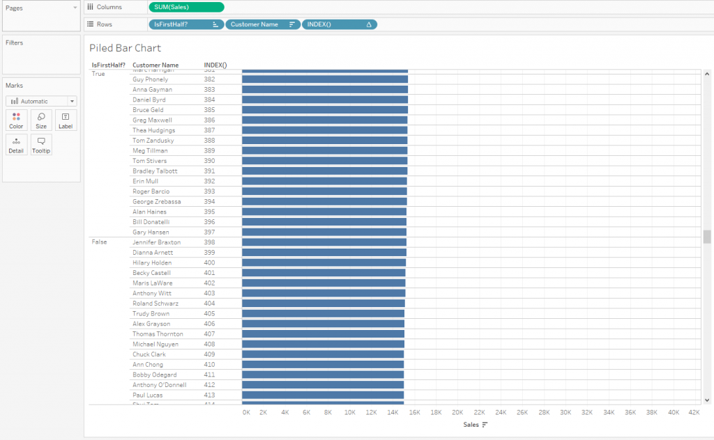
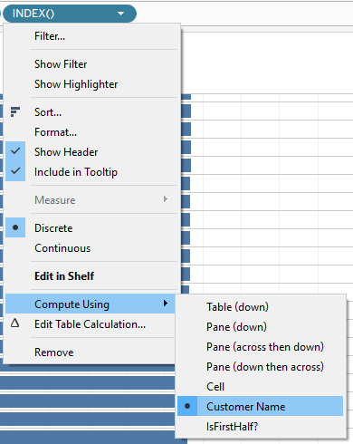
I scrolled down a bit and what you can see is, that index gives us the number of the current bar, starting at 1 on the top. We now need to tell Tableau to start at 1 again, once “IsFirstHalf?” switches from TRUE to FALSE by clicking on the INDEX() pill, and choosing “Compute Using” and “Customer Name”:
The result is a graph which looks like this
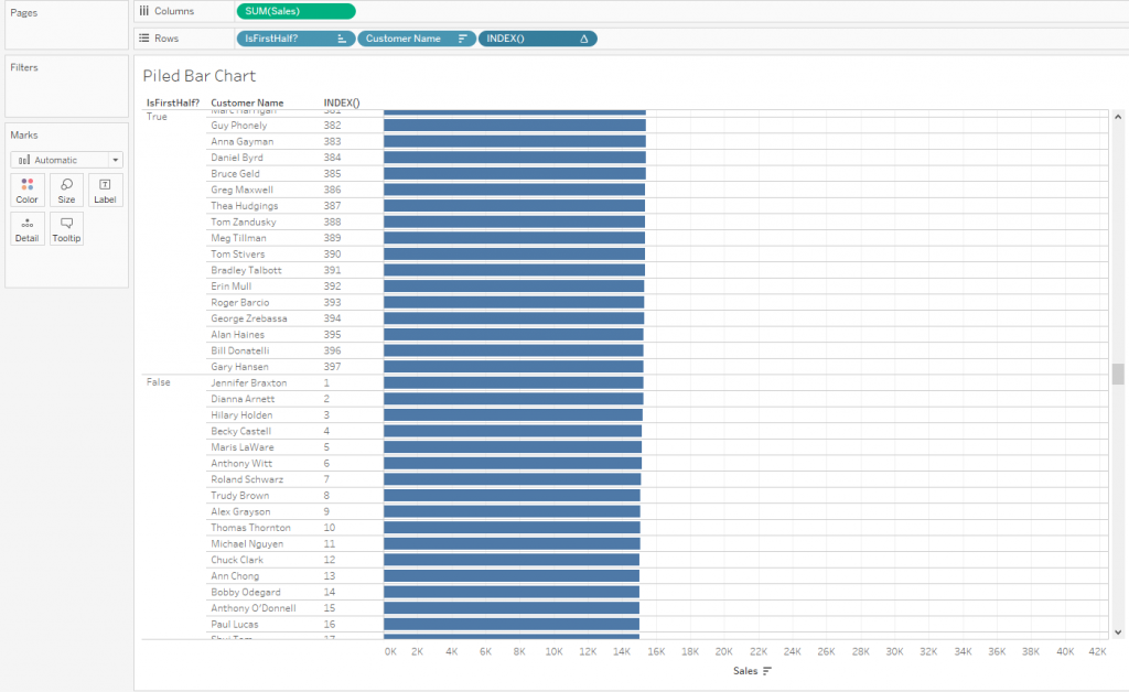
The only thing left is to reorganise the different pills like this (pay attention to the order of the pills in the marks card)

And to turn of the stacking of the marks:
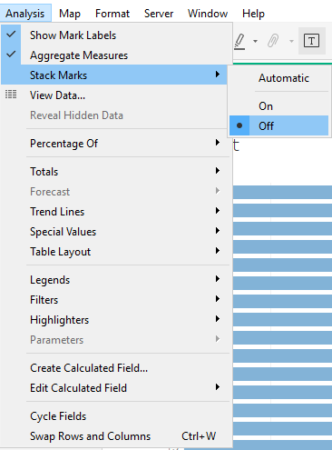
How do I make it look good?
There are two main problems with this kind of visual
- You will need to label the bars appropriately
- You will need to make sure people understand they are not looking at a stacked bar chart
Since every row represents two values, we cannot use the normal dimensional labels on the left, instead we need to drag the customer name to label and enable the “Allow labels to overlap other marks” option (I assume here that labels are needed as it is impossible to otherwise get insights out of this particular graph. Maybe you can find a use case which doesn’t require labels). Depending on the distribution of your values, you might end up with overlapping labels, which cannot really be avoided. Disabling the “overlap other marks” option would remove all labels from the inner bars and leaves us guessing what values are represented.
The second problems can be addressed in different ways. The original graph in the example in the beginning used fading colours to indicate that a new bar begins. In Tableau we cannot use fading like this. Alternatively we can use size to indicate that we look at two different bars, we just need to make sure the wider bar is in the background to actually see where they start. The following two examples could be possible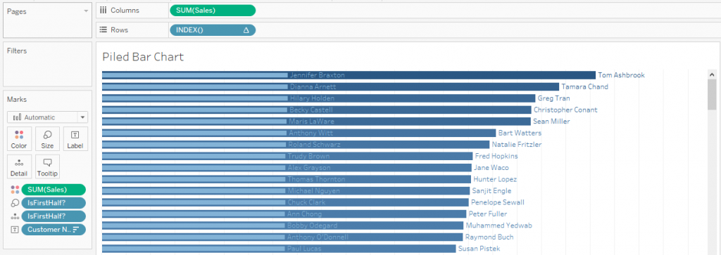

To consider is only the colour of the bars and the labels to make sure they are legible.
How do I customise it?
With this solution, you just need to adjust the SalesPerCustomer measure. Change the fixed calculation to include whichever dimensions you need in your graph.
You might also want to filter your graph. In this case you have to add your filter to context! Because of the order of operation in Tableau, the FIXED calculations are applied before filtering so if you want to enforce the filtering you will have to click on the Dimension in Filters and choose “Add to context”.
Another really useful Filter would be “Top N Customer Name”. With this you could display the top 50 customers in only 15 rows and give a quick overview without having to scroll down a long list. (Again, add it to context)
Can I have more than 2 bars piled on top of each other?
Yes, with some limitations.
- You will only be able to do powers of 2 (2,4,8,etc) as you will need to calculate the median of the two sections you created in the first step
- You will run into space problems already with 4 bars
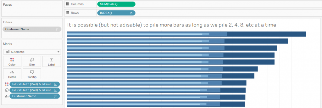
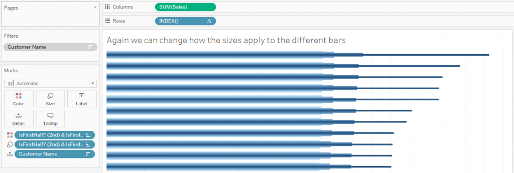
If you have a look at my Tableau Public workbook you will see how I piled 4 bars but you will also see that there is barely any space for labels left and it becomes really busy close to the 0 line due to the 4 different shades of blue.


