

In the last couple of weeks I stumbled upon the same Tableau problem three times. Once it was my own problem, afterwards two other people mentioned similar problems. That seems reason enough to try to figure out a solution to it!
Imagine the Tableau Superstore data set, you have one order per record with an Order Date and a Ship Date. A common question might be “How many open orders do we have on any given day?”. If you don’t work in Sales, you might want to replace orders with support tickets or you want to have a look at number of staff employed by your company at any given time. The idea is the same, you want a daily view of items which were opened/started but not closed/ended yet.
If you just want to look at one day, the solution is reasonable simple. Two filters for each of the date fields will suffice. Make sure that you only consider the records where the open date is smaller than day X and the close date is greater than day X. If you want added flexibility you could utilise a parameter to allow people to easily change the day they are looking at.
If you would like to look at a time series to see trends over the last 12 months you will run into a problem though. There is no readily available method to do exactly this. Why is this?
You can’t display data that is not there!*

To understand why it is not possible in Tableau, we have to understand what Tableau does when it visualises data. If we create a simple unit chart, with number of sold items per day for example, Tableau considers all records in the data set, counts all items for each day and plots them on a graph. It makes sense that the number of squares equals the number of records and that each record appears only once at the day when it was sold. There is no way we could end up with 6 squares if we just sold 4 items, neither could one record appear on two different days.
Now let’s think about what an analysis of open sales per day would mean. If we order something on a Monday and it is delivered on Wednesday, this sale is open on Monday, Tuesday and Wednesday. For our use case, it will need to appear three times and as I explained just before, it usually doesn’t make sense to display a record more than once. So the only way around this is to duplicate the open sales record for each day it is open and therefore give Tableau what it demands.
Quick and dirty, aka. Excel to the rescue
There is only one way to create rows in addition to the one in the original data set within Tableau: A join!
If we bring in another data source, depending on the type of join, we can end up with less, equally many or even more records – that’s what we will do!
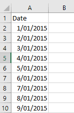
- Open Excel and create a file with only one column
- Enter the date from where you want to begin your analysis
- Highlight the cell and drag down the frame so that Excel fills each cell with the date of the following day
- Stop at a date which is a couple of years after the max date of your data set
- Save the file (eg. as dates.xlsx)
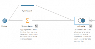
What we created here is a scaffolding which we can use in Tableau to attach our actual data set to. Once we have done this, we can bring our original data set and our scaffolding data set into Tableau like this:
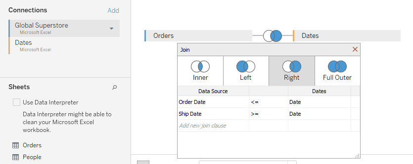
Be sure to define the join type correctly, in this case “Dates” is the “right” connection, therefore we want a “right join”.
This tells Tableau to go through the scaffolding, and for every day X, take all records where the order date is smaller or equal X and the ship date is greater or equal X. Then take the next day and do the same thing again. This way for our example from above, our order will appear 3 times – for the Monday, Tuesday and Wednesday – in the data set, therefore we will not have a problem plotting it three times.
Problems!
I would only use this method if I needed to do a quick and dirty analysis, maybe to confirm some other figures or give a rough overview for a one-off question. This method has a few drawbacks!
- If you don’t update your file, at some point the actual date will be after the max date in your Excel file. You can add dates up to eg. 1st of January 2100 and assume that whatever you did won’t be used anymore by then but that’s really bad practise!
- For every analysis you do, you will have to embed the Excel file in the workbook, which adds complexity and if somebody else looks at it, they might not understand what you did there or why.
- Currently 2018.3 it won’t work if your original data set is a Tableau Extract, as this one does not support cross data base joins.
- Inadvertently connecting to external Excel files will cause problems if you change computer, change a file path, somebody deletes it for whatever reason, etc.
You can try to mitigate these problems but it would be better to not even create them in the first place!
Using Tableau Prep to prep the data
We use the exact same technique, however this time we avoid Excel and the problem of updating our date table. Instead, we use Tableau Prep, as you will have a license for it if you have a license for Tableau Desktop.
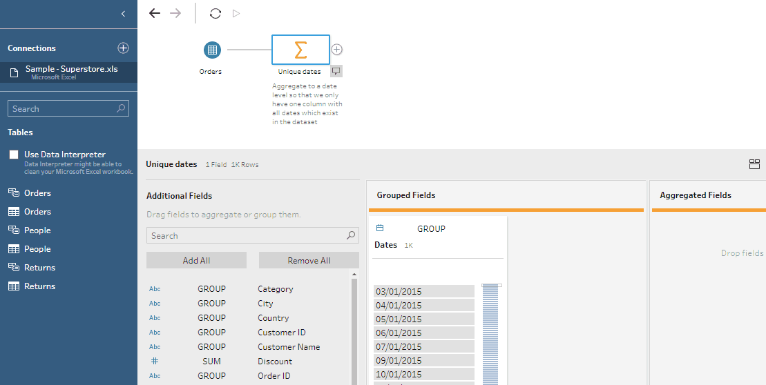
We connect to our original data set and the first thing we need to do is get a list of the unique dates in it. We can do that with an aggregation like this:
Next up we do the join which we did in Tableau before, just now in Prep. The setup is exactly the same:

Make sure you select the right join (ie. a right or a left join). And check that you end up with more records after the join than before the join.
Now we can output it to a CSV or hyper extract and look at it in Tableau.
Considerations!
This solution is a bit more elegant as it makes sure that you have a scaffolding date for each date which is in your data set. You will never end up with a situation in which you need to update something because your scaffolding file is out of date.
On the flip side you only have the days available which are in your data set. If you don’t sell anything on a Sunday, you will not be able to see how many open orders you had on that Sunday.
I would argue this is fine. As there was no change in orders, it will just appear as a straight line and will pick up again on the Monday. If you want a bit of added security, you could do the same thing for the ship date and take all unique dates from both streams.
You will have to accept that the workflow needs to run in order to update the data but if you use prep in production, this is a robust way of dealing with the problem. You could apply similar techniques in any other ETL tool, if you happen to not use Prep.
Solving the problem at it’s root – in the database
I would argue, the most reliable solution is to do it on the lowest level possible, which is usually the database/data warehouse of your choice. Not everybody has access to it but if you can at least connect and read from it, you could use the below snippet to create a custom SQL query in Tableau, which is the next best thing after doing it directly in the database.
You just need to create a view with a syntax similar to this:
SELECT unique_dates.[Date] AS [Date]
      ,full_dataset.[Order_id]
      ,full_dataset.[Order_date]
      ,full_dataset.[Shipping_date]
      ,full_dataset.[Other Attributes]
FROM [Superstore_Sales] AS full_dataset
  RIGHT JOIN (SELECT DISTINCT [Order_date] AS [Date] FROM [Superstore_Sales]) AS unique_dates
	ON full_dataset.[Order_date] <= unique_dates.[Date]
	AND full_dataset.[Shipping_date] >= unique_dates.[Date]
This does exactly the same thing as Prep before just in SQL code. If you want to, you can get all fancy and create a dynamic scaffold which gives you every date between eg. 5 years before today and 5 years after today, make it use only weekdays, etc. The above is the direct translation of the Prep workflow.
Challenges!
I cannot think of any technical problems if it is implemented correctly. The main challenge will e to get access to the DB and develop a view like this, which – depending on your organisation – might be quite a big one.
Apart from this it’s a transparent change which will apply every time somebody connects to this data set and will always return the most recent records. The only limitation is that it returns only data for the dates that were initially in your data set, like the Prep solution.
How do you use it?
The main change to keep in mind is that you will need to use the new “date” field if you want to figure out the open orders per day. You will also be able to look at it on higher levels (eg. monthly or yearly), the only thing to remember is that each order will appear several times. so to avoid double counting, use COUNTD on your unique identifier (ie. order ID).
General comments!
Now here is the fine print!
As I said in the beginning, this technique creates multiple copies of the same record. This is usually fine, however depending on your data or if you make a mistake in your join, you can very quickly end up with a few orders of magnitude more records. This might impact the system on which you are doing it, so be mindful of this!
In your analysis, you cannot just add up your sales figures any longer, as some might be there 3 times, some 5 times, which will completely skew your results. The safest way to deal with it is to have both data sources and use them for their respective purposes. Depending on the analysis, you might be able to get away with averaging the 3 or 5 values but this is quite risky if you are not 100% sure of what you are doing.
In any way, make it absolutely clear to your users, what this data set means and how it is supposed to be used! If you created it, chances are you know the ins and outs, but if you publish it for others to use, very quickly, somebody will end up with inflated numbers if you are not clear about what it is.
Let me know if you managed to solve a problem with this approach or if you think there is another, maybe even better, way to address it.