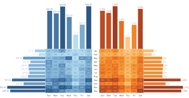
I recently analysed call data especially focusing on pattern throughout the week. After creating two heatmaps to plot hours of the day against weekday for number of calls and call length, I continued to create marginal histograms for further details. While trying to figure out smart ways to combine two marginal histograms I came up with a few ideas.
A quick reminder, a marginal histogram is a graph that looks somewhat like this:

A heatmap in the middle which encodes magnitude of a measure through colour and bar charts at two sides of the bars which encode the sum/avg/etc across each row and column. In the graph above for example you can see summed sales values of each weekday in a month in the heatmap and the sales per weekday throughout the year and sales per month in the vertical and horizontal bar graph respectively. If you would like some help to create one in Tableau yourself, head over to the Dataschool for instructions.
So far so good! If you create one for yourself, you will quickly realise that the correct positioning is somewhat awkward to set up (at least in Tableau; made so much easier with the introduction of inner and outer margins). Apart from that, you also end up with this weird white space in the top right corner. (I don’t generally mind white space but in this case I din’t really like it)
It is big enough to feel empty but too small to put in another graph. I would also hesitate to put filters in there unless they only target the marginal histogram.
If one is already awkward, what do you do with two of those?
I played around with a couple of options, some a bit more practical than others. So have a look below and maybe feel inspired for your next dashboard!
Side by Side
This version does not handle the white space in any way. It just accepts the fact that there is unused space and goes ahead with the analysis.

I don’t think it’s a bad solution, in fact it might actually be the best one, considering the layout it consistent across both graphs. I also find that the repetition takes away the prominence of the empty corner.
Mirrored
In this example, the amount of unused white space stays the same, however I got rid of the redundant labeling of the rows.

I find it more harmonic because it combines the 2 different versions into a whole. We introduce the concept of inverted bars though, bars which go from right to left. It’s not unusual to see those but usually they suggest negative values, which in this case is not true.
Turned
This combination is actually the most space efficient one. It turns the second graph 180 degrees so that it fits neatly in the unused space.

I like the efficiency but it makes it very hard to compare any of the bars to each other. While in the previous versions there was always a commonality to them (eg. August bar was in the same row, Wednesday bar was in the same position), this one inverts both histograms of the second graph, which makes a simple comparison nearly impossible.
Overlapping
This is the most rogue idea I had today, flipping the mirrored version around and overlapping the horizontal histogram.

This is one of these ideas that might work in this one particular case but in most situation you are probably better of just ignoring it. It does get rid of 50% of the unused white space but this happens at the expense of readability.
I had to remove the labels as it would have been too cluttered otherwise. It also has an inherent problem where the longer overlapping bars are harder to distinguish. The shading gets darker the longer the bar is and most combination of two dark colours will look very similar.
It might work if you display two measures which will never overlap, eg. male/female distribution or visits on your website who ended up buying/not buying.
Summary
It was a good exercise and creating a bunch of different versions of the same graph made me think about some of my assumptions (is that white space really a problem?) and also highlighted problems I didn’t think about (labels in the overlapping versions don’t work).
For the analysis I am working on I will probably end up with the first version, just because it seems a bit more “neutral” while the second one is a bit more “playful”, although I personally prefer the second version.
If you want to have a look how I created those, you can have a look at the graphs and download the workbook on Tableau Public.
Let me know if you end up using one of these ideas, it would be great to get some examples, especially for the last two versions.
By the way, in terms of call patterns, there are less but longer calls the later it is in a day and the week. There is an interesting drop in call numbers and an increase in call duration on a Friday afternoon…I wonder about the reason for this…


