

Especially for ad-hoc analysis it might be necessary to highlight only certain parts of the data. It is easy enough to call out certain sections with colour or annotations, however you might want to provide the ability to provide a little more information – just in case. With Tableau 10.5 you have the possibility to provide a more detailed breakdown through a viz in your tooltip and with a bit of customisation you’ll be able to show it only for the important parts of your data.
As I already wrote here, I had a few ideas about things to do with Tableau during my last vacation. I was still thinking about the details for this one, when I saw Simon Beaumont’s blogpost about Creating a viz with two different tool-tips. He obviously had a similar idea as I and was the one to post it earlier. However, since I have a slightly different angle, I’ll go on with describing it, in the hope to compliment Simon’s post. If you are too impatient, you can jump ahead and try the interactive version on Tableau Public.
The Problem
Tableau provides tool-tip functionality, which allows you to define a tool-tip for your graph to provide additional information – that’s hardly news. For most use cases this is sufficient, there might be situations however in which you would like to either provide two different tool-tips in one graph (as per Simon’s post) or provide a tool-tip just for a selected part of your viz.
The Setup
For this little example we assume we work for the Tableau Superstore and our boss asked us to provide her with a slide about our latest sales figures to make her look good in the next meeting. So far so good, it might look something like this.
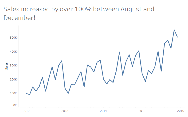
There is definitely some sort of highlighting missing as it is difficult to see which months are August to December. There are two ways to highlight a certain section of a chart in Tableau:
- With a Dimension: Create a calculation similarly to the one below, drag it to colour and make it an attribute
// [IsTimeOfInterest?]
[Order Date] >= #2015-07-01#
AND [Order Date] < #2015-12-01#
- With a Measure: Create a calculation similar to the one below, drag it in the graph and make it dual axis
// [TimeOfInterest]
IF [Order Date] >= #2015-07-01#
AND [Order Date] < #2015-12-01#
THEN [Sales]
END
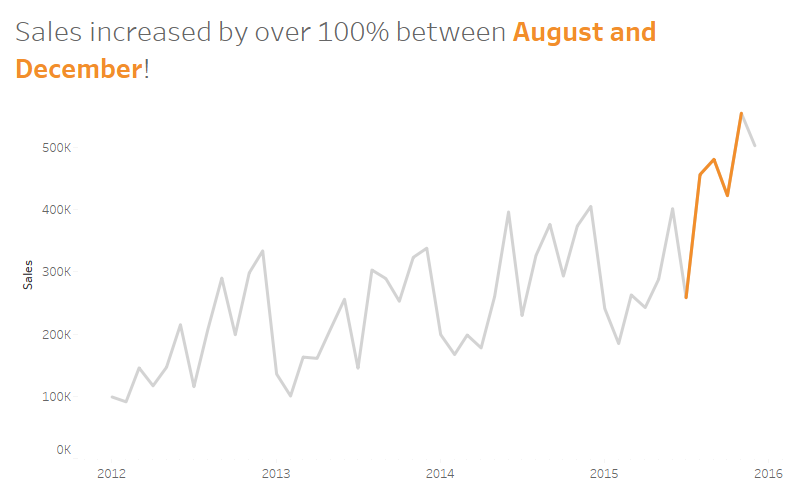
Both will look very similar, with the second option however we get more possibilities to play with layout and functions, as we get two sets of marks to work with. We can start by creating a graph like this, which makes it a lot easier for our boss to see what she should pay attention to.
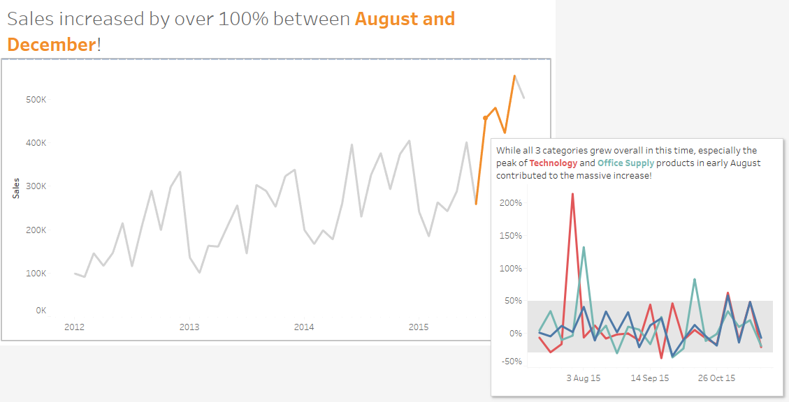
We also know that our boss would like to shine, so we need to provide some background information for the selected period in order to support her. We could provide it on a separate sheet or we can add it as a tool-tip to be easily accessible for her.
The Solution
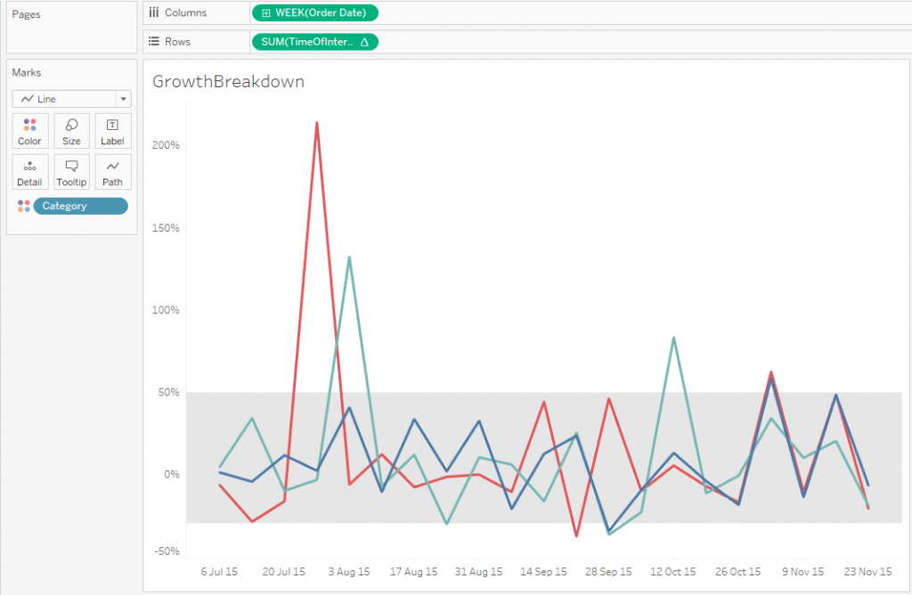
We create a separate graph with the weekly growth per category for the important period. The TimeOfInterest pill on rows is the calculated field which we created before. It is set up as the percent difference from the previous value. The gray band in the background is 1 standard deviation in either direction for context.
We add the second viz in the tool-tip for the [TimeOfInterest] measure and test the viz. There are two things you will notice:
- The gray parts of the line still have the standard tool-tip
- Our viz in tool-tip filters for a particular month
To solve the first problem, we edit the tool-tip for the sales measure and remove all text. Generally Tableau has the possibility to not display a tool-tip for a viz, however you can only deactivate it for a whole sheet, not only for a single measure.
The second issue might actually not be a problem as it might make sense to filter by a value (month in this case). My idea was a single tool-tip which doesn’t change, so I will need to work around it. As far as I can see, there is no way to tell Tableau to not filter at all, so we tell it to filter by a dimension which is not used to drill down. In my case I changed the whole viz part to this:
<Sheet name="GrowthBreakdown" maxwidth="400" maxheight="300" filter="<Category>">
At the end we have created something that looks like this.

Our boss can use the dashboard for her presentation and is able to quickly get some details if necessary by hovering over the highlighted period.
But why not a tool-tip for the whole graph?
- If the rest of the data is irrelevant, our boss doesn’t need to worry about it. Providing additional information might distract and might lead to wrong conclusions
- Having the same tool-tip for the whole graph will be confusing as we need to chose one of these options
- display the 4 months in question for all periods, which doesn’t make sense
- filter down to only one month which I didn’t want to do as the scope of the analysis was 4 month
- display the whole time frame in the tool-tip as well which makes it chaotic with weekly data points
This technique can be used for different graphs and different use cases so some of the above options might be good choices for other kinds of analysis. Depending on the cart type, there might be some additional calculations necessary (think of bar graphs and highlighting sections which are not at the bottom) but they will all require this general setup as a dual axis chart.
Let me know if you find other applications or if you end up applying this technique in one of your dashboards.