


Deconstructing assumptions with data physicalisation
This post first appeared in the Data Visualization Society’s Medium publication “Nightingale” as part of their “Data Sensification” series. The content is the same with the exception of a little update at the end.
In the beginning of 2020 I decided to attempt using LEGO bricks as a map-building material for a map of Aotearoa (New Zealand). (I wrote about the full process and the technical details and challenges in my blog.) Initially it was “just a cool project,” but in the process of building it, I did learn a few things about maps, how we perceive and process spatial information, and where traditional paper maps excel over three dimensional models and vice versa.
There are at least three different “models” that are commonly applied to geography and spatial positioning. They are:
- The real world — the actual location of cities, orientation of roads, etc.
- Maps — a representation of the real world (e.g., for navigation)
- Mental models — how you think about a country or a city when you don’t have a map available
These three models often differ quite significantly from each other. Maps have the inherent problem that representing the surface of a sphere in a two-dimensional space is not possible without distortion. Mental models are an even more significant simplification of the real world or a map, as Aris Venetikidis describes nicely in this TED talk.
In our mental models, we assume streets to be straight and intersections to be 90 degrees. Since that’s rarely ever the case, it explains why, when I look at a map, I am always surprised to see how streets are oriented or geographic features positioned. Very rarely does this orientation align with how I pictured that in my mind.
But, orientation and position are not the only aspects to consider when it comes to maps. We live in a three-dimensional world, but representing this in a two-dimensional map ignores one dimension. To address this limitation, mapmakers usually use colour and/or elevation lines to encode height (the third dimension) on a map. Most people are probably used to seeing mountains in brown or grey and regions closer to the coast in green or yellow, but interpreting elevation lines requires a lot more knowledge and abstract thinking and, even then, I find it difficult without some practise. For me, neither of these techniques actually provides enough information to form an accurate mental image of a place, one were I can confidently say that I have an realistic idea what a landscape looks like. When colour is used, it often blends visually into a big brown blob, maybe with some white peaks here and there and elevation lines are useful for visualising detail in a small area, but fail to provide an overview of the terrain of a whole country.
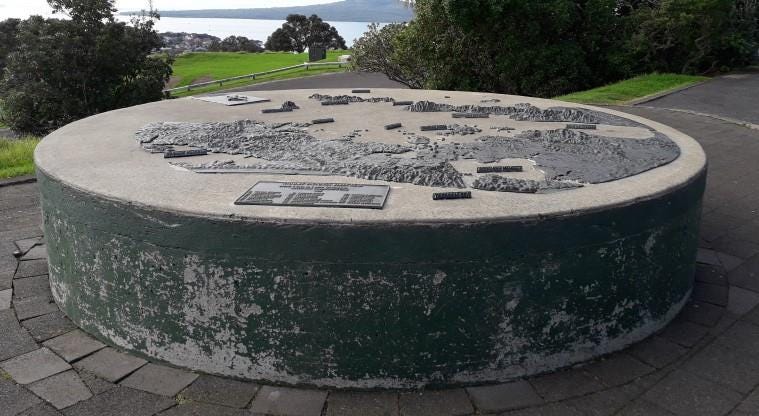
The best option is to represent elevation with elevation — to create a three-dimensional map that offers a more realistic impression of a mountain range, for example. You might have seen some of these in museums, or maybe at a lookout where it describes the surrounding landscape, but how would you go about building one yourself?
While three dimensional maps seem to have obvious advantages, they also come with problems. Two-dimensional maps are easy to obtain with OpenStreetMap and Google Maps just a click away. Paper copies are virtually free when you just print out whatever you need. For a three-dimensional map, however, you need a structure or material that can sustain the third dimension. You need to acquire the material — which might come at a cost. You need a place to store it. And, they come with an additional major drawback. They are unusually permanent, since you cannot roll or fold a three-dimensional structure.
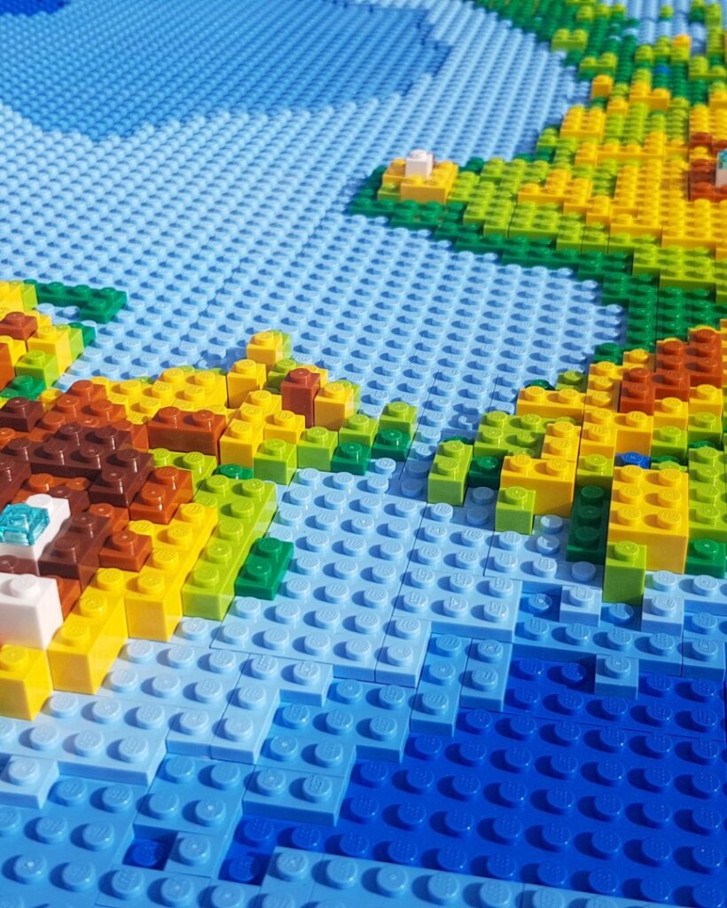
In my case, LEGO seemed like a good overall compromise: using it is very simple, it is not too difficult to come by, and I can either build something else or resell it if I don’t like it any longer. The actual construction was the easiest part of this project; however, planning took roughly 90 percent of the time. Getting the elevation data, preparing it in QGIS, building a virtual model, and ordering the bricks was actually the hard part. Each of these tasks took significantly longer than building it (after all, I had years of training in building LEGO when I was younger).
After building the map and having it hanging on my living room wall, I can say that my effort paid off. Beyond the obvious benefits of having an awesome conversation starter and the coolness-factor of a huge LEGO map, the resulting map continues to reveal novel details about New Zealand geography. Certainly, this stems from my ability to review the map every day.
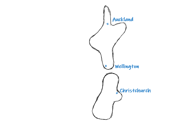

On the left you can get a rough idea of how my initial mental model of New Zealand looked like. At the project’s outset, I envisioned a straight line from the northern tip, through Auckland and Wellington, towards the southern tip of the country. A lot of the coastline was straight and there were only three mountains on Te Ika-a-Māui (the North Island), while Te Waipounamu (the South Island) was nearly exclusively alpine.
On the right you can see that none of these assumptions is actually true!


But more interestingly, I now have a tangible way to explore the geographic details of New Zealand that were previously lost in the visual encoding in maps.
I can closely inspect how the North and South Island are connected through the Cook Straight. I can clearly see Mt. Taranaki — which is a phenomenon in every map. And I see the “Central Plateau,” which until then, was just an abstract area of the country in my mind. I think the most stunning discovery on the map (and in real life, if you ever get the chance) is the Fiordland area on the west side of the South Island. If you look at a normal map, you can see that it’s a very mountainous area, but this 3D version makes you appreciate, that it is situated right next to the ocean and that the average elevation drops dramatically to sea level and even beyond, the sea floor drops abruptly, unlike any other part of the coastline.
Most people would agree that seeing data represented visually is much easier than looking at the raw numbers. But, being able to see and feel a physical representation of data makes it even more understandable and memorable. The benefits of a medium like LEGO are that you can quickly model terrain and you can iterate and reconstruct as you go. Furthermore, because it is so easy to use, the builders acceptance to deconstruct is much higher than when building physical objects, for example, from wood or paper mâché.


All of these aspects are actually perfectly suited for classroom projects to explore local geographies. Since publishing this project I did have a few discussions with teachers who confirmed that it would be an engaging way to teach students about geography, maps, and elevation. If somebody out there is interested in it, I’d be happy to help bring a map like this into a classroom.
The main disadvantage of LEGO as a visualisation medium in comparison to “traditional” visualisation techniques is, of course, its limited ability to create models dynamically and at scale. While this means your business reporting will still have to rely on charts and tables, you might find other cases in which data is static and manageable enough to physicalise it. A timeline of your company history, your sales territories, or the geographic coverage of your logistics network, are only a few examples that could easily benefit from an added physical dimension; and having a display like this in your lobby or at your conference booth can be a powerful statement and engage your customers in new ways.
I am not the first to build three-dimensional maps out of LEGO. I am not even the first to build parts of New Zealand in LEGO! There are a number of amazing examples online and my collection steadily increases so I would like to give a big shout-out to everybody who does create data-driven LEGO displays.
UPDATE: Tom Adams used my map as a basis to build a 2 dimensional version for his geography classroom in Christchurch!