

The (not so) new parameter actions in Tableau introduced the possibility for much more interactivity and navigational elements. For this weeks #MakeoverMonday, a friend asked me if it was possible to select one item in an ordered bar chart and display the 10 items just above and below it dynamically. Well it is with parameter actions (it actually was before already). But the nice thing is that, together with the animations in Tableau, you can use this approach to navigate up and down through a visualisation.
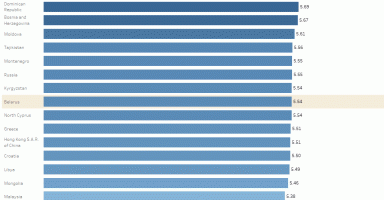
How it looks like
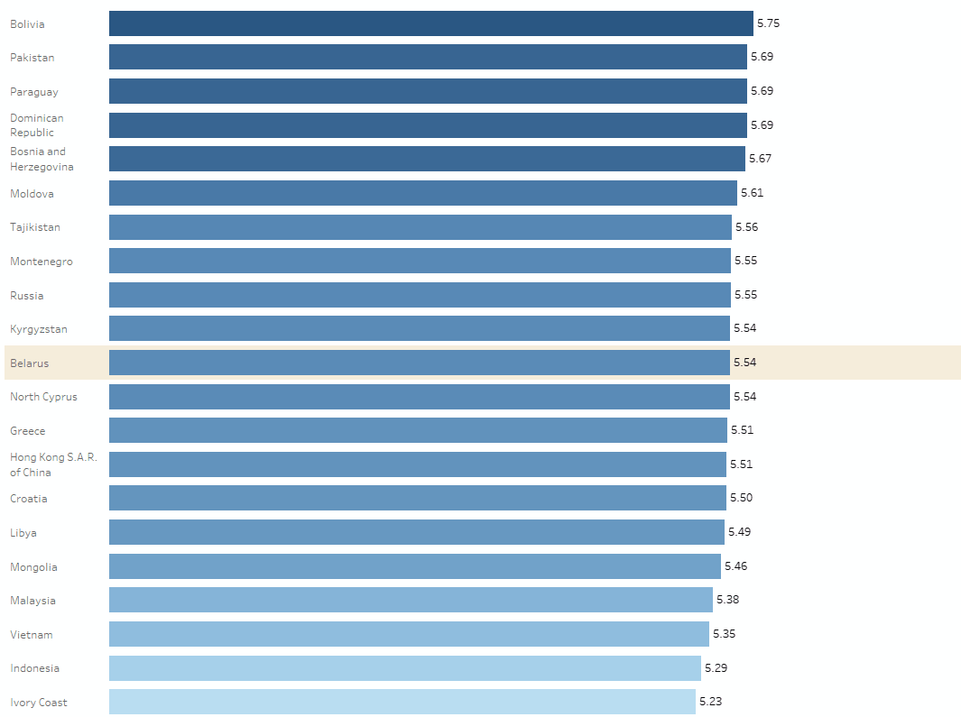
This is how it looks like animated
And this is the workbook on Tableau Public. Unfortunately the animations are not as smooth on Public as they are in Desktop.
How to set it up
You can find the data on the #MakeoverMonday Website and the workbook with this technique on Tableau Public.
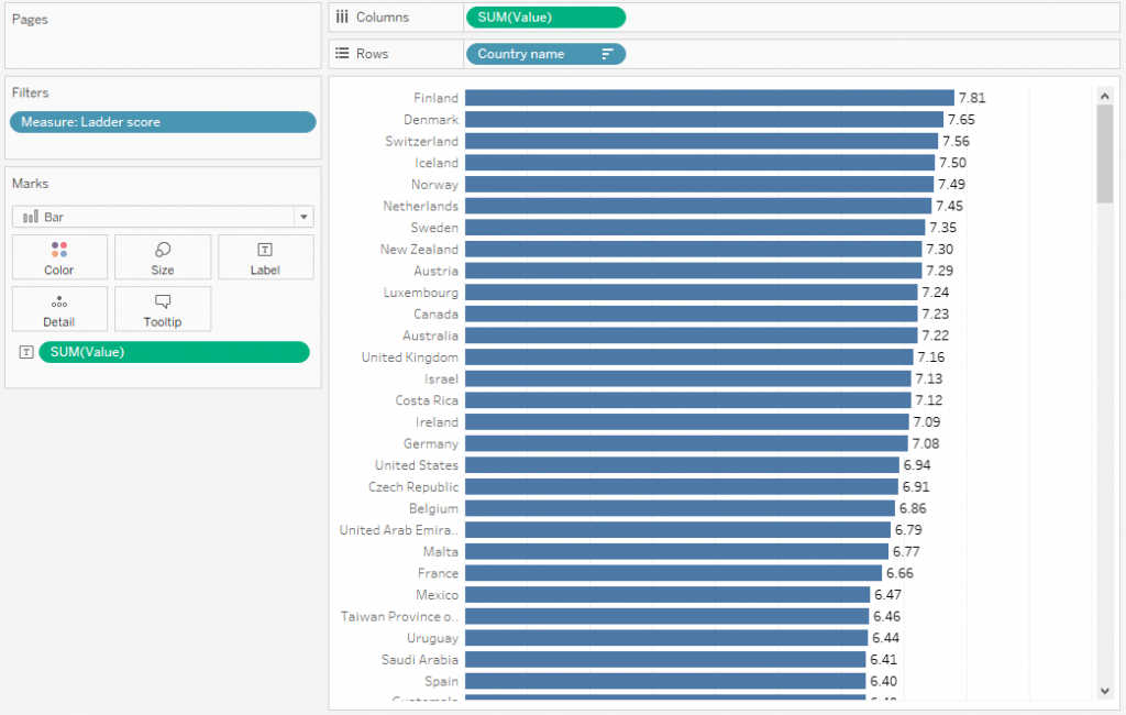
First we create a simple bar chart, in this particular case I use the ladder score but it works with any measures you might have.
It’s ordered by the measure and I added the value as a label at the end of the bars as well.
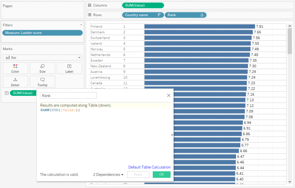
In order to determine the 10 countries before and after the selected one, we will need the rank for each country.
RANK(SUM([Value]))We then drag it to rows in order to see it in the chart.
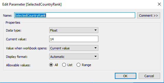
We then need two parameters, the first one that stores the rank of the selected country. It will be set up as I did on the left. The current value is not important, I set it to 14 to see if my calculations work properly but it is not essential.
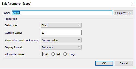
This parameter is rather nice to have then actually necessary. It defined how many countries before and after are displayed. You can hard code it in the following calculations but having it as a parameter will make it much easier to change.
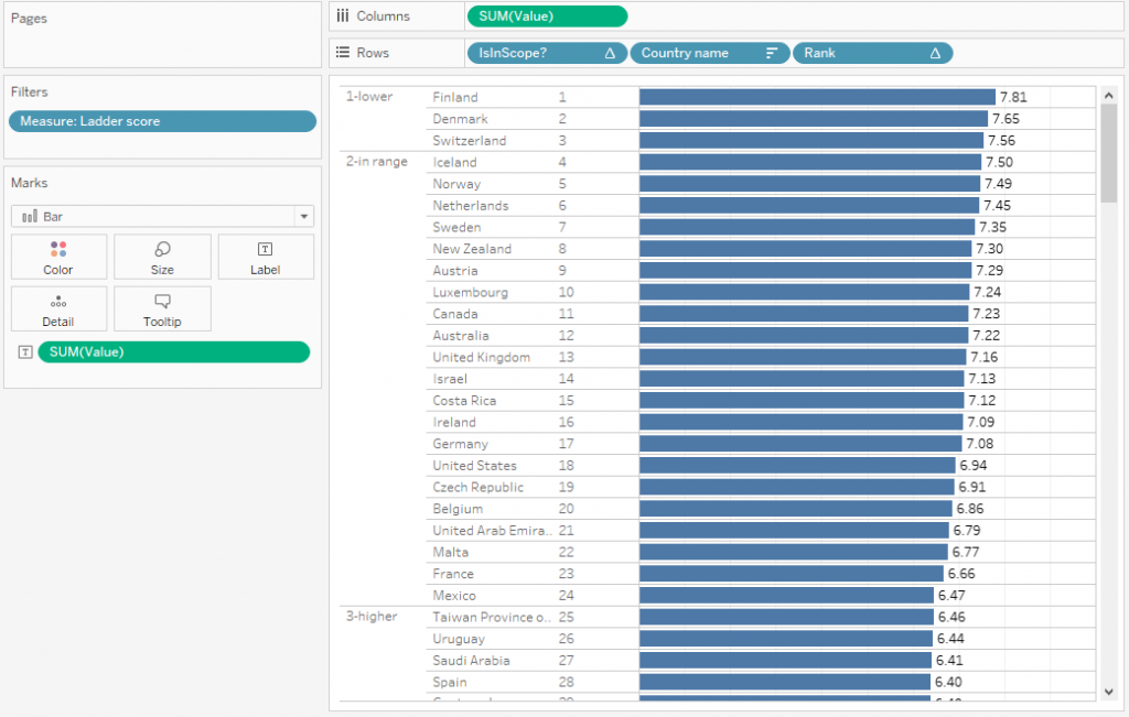
Next we need to define which countries should be displayed and which ones are lower or higher (and should therefore be excluded).
This can be achieved with the following calculated field “IsInScope?”
IF RANK(SUM([Value])) < [SelectedCountryRank] - [Scope]
THEN '1-lower'
ELSEIF RANK(SUM([Value])) > [SelectedCountryRank] + [Scope]
THEN '3-higher'
ELSE '2-in range'
END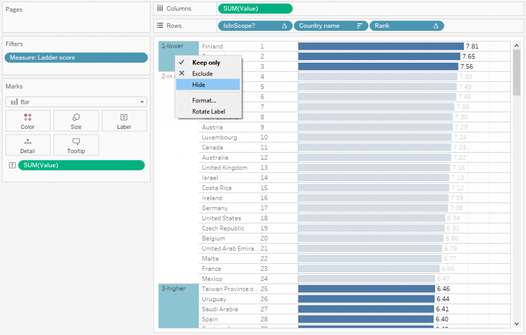
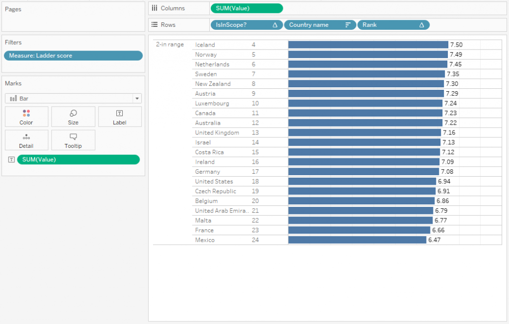
Once this is done, we can hide the lower and higher values to display only 21 values. 10 below and 10 above the 14th country in the chart (that’s the 14 we defined in the first parameter).
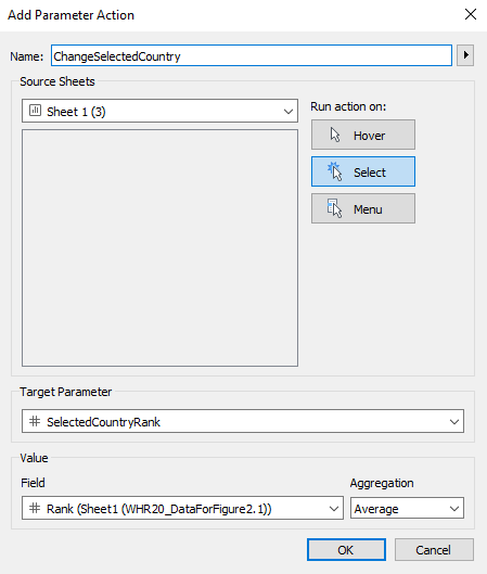
To finish the basic functionality off, we just need to add a Parameter Action which changes our parameter value to the selected country value.
Now when you click on a country on the bottom, the chart automatically jumps to that country and displays the 10 countries above and below that country. The problem is that it’s ugly!
There are a bunch of things on the chart which we don’t need to display and Tableau by default grays out the bars that are not selected, which is pretty irritating.
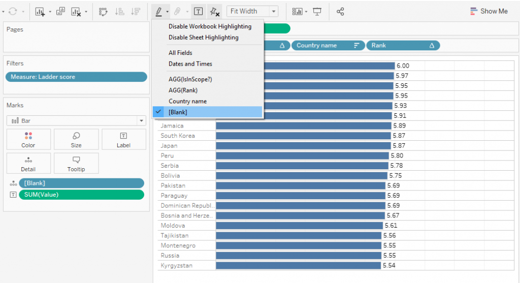
We can hide the “IsInScope?” and “Rank” calculations and remove the axis. In order to remove the highlighting of the selected bar, we create a new calculated field “[Blank]”
""Yes, it’s empty on purpose! And set up the highlighting as per the screenshot on the left.
Additional we fix the axis (in this case at 10) in order for the bars to use a common scale, otherwise the topmost bar would always reach all the way to the right.
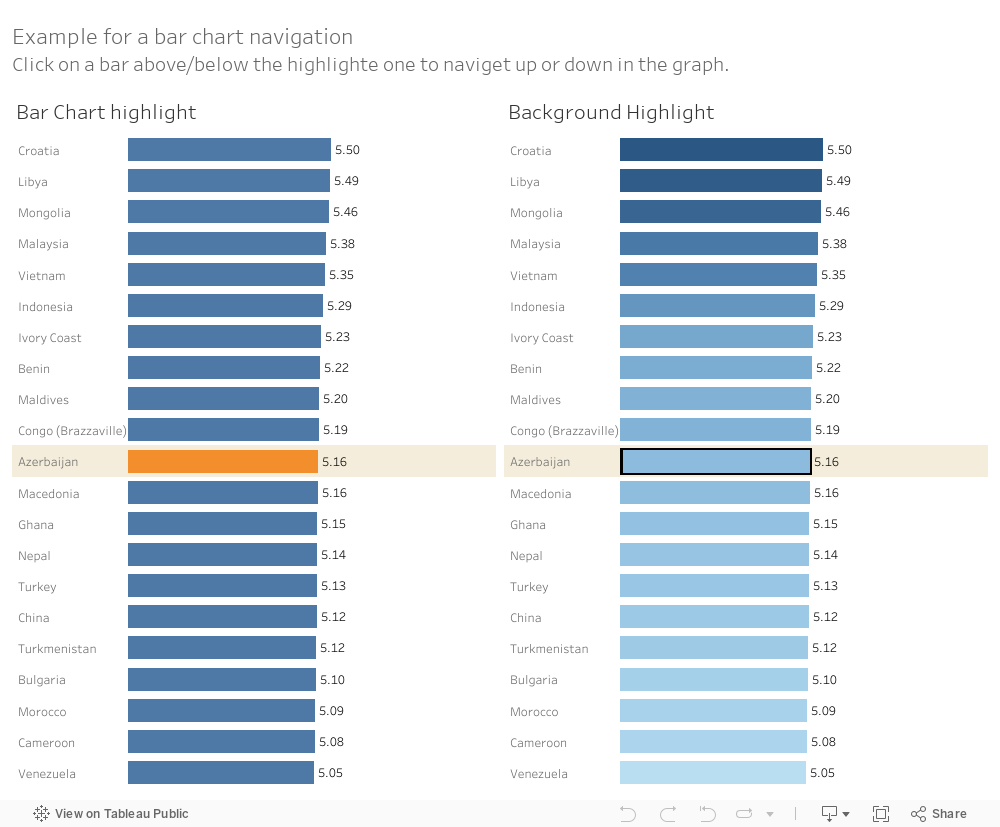
So far we created some simple navigation through a number of bars. It works as expected but in terms of usability there are a few tweaks we can apply to make it easier to use.
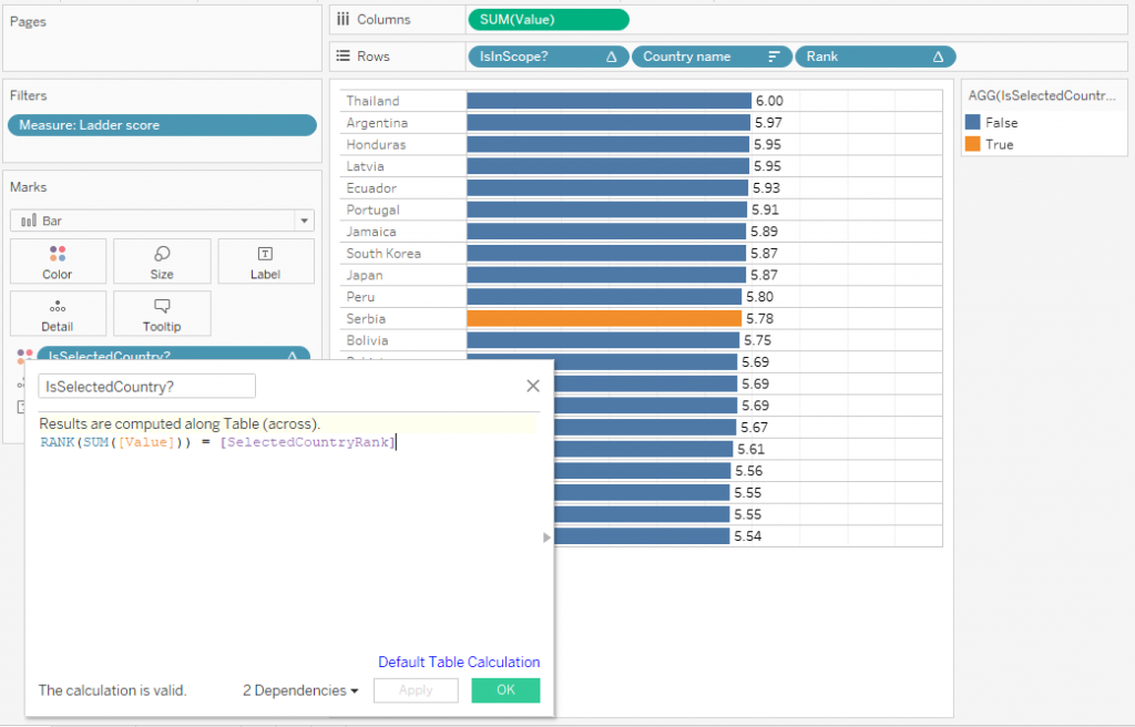
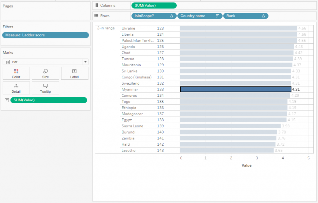
One option is to highlight the selected country in one colour, which makes it easier to identify.
It is as easy as creating “IsSelectedCountry?”
RANK(SUM([Value])) = [SelectedCountryRank]And dropping it on colour
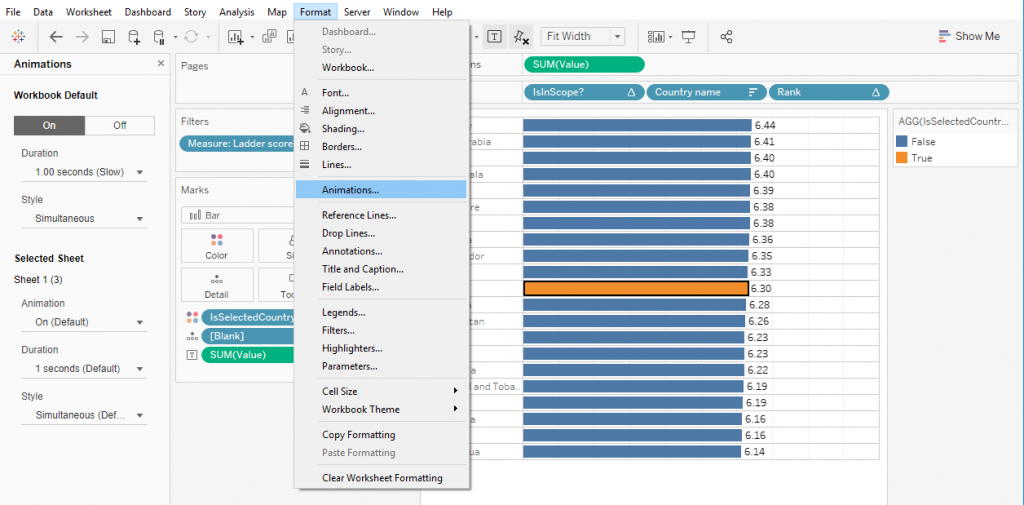
Next, we want to add the animations. Animations are not always necessary and are sometimes straight out distracting, in this case however it helps the user to identify what is actually happening. Without animations there are suddenly just different bars, with animations the user can actually see if they scroll up or down.
You can access the menu through the “Format” option at the top. I’d recommend to set the speed to 1 second since it is reasonably quick but still makes it clearly visible what is happening. But in the end that’s up to you to decide.
Lastly we can change a few things around to make the graph easier to understand.
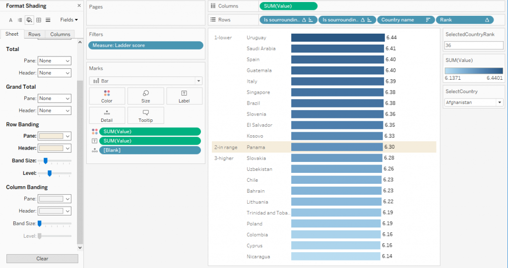
Adding [Value] to colour will make the ranking clearer and we can use the row banding feature to colour the selected country in a different colour.
For that we need one additional calculation in order to single out the selected colour to use the row banding:
IF RANK(SUM([Value])) < [SelectedCountryRank]
THEN '1-lower'
ELSEIF RANK(SUM([Value])) > [SelectedCountryRank]
THEN '3-higher'
ELSE '2-in range'
END
What to consider
As always, there are a bunch of things to consider when doing something like this. I think it’s a slick approach to pagination but obviously limits what your users can see at once. Usually you might want to compare all values to each other or at least the top/bottom N so displaying only 21 “random” bars might be misleading.
You will also need to make clear that there is actually the possibility to navigate. If you don’t know it, it’s not an intuitive way to interact with a bar chart so this can cause issues.
Lastly – as with so many interactive elements – consider if your dashboard is understandable if somebody screenshots it. Without any context, somebody might be able to scroll to the bottom of the list and claim the country that appears on top performs best. While this is obviously intentionally misleading, this could also happen when somebody just opens your dashboard without realising that they see only part of the whole picture.